LAX Wayfinding System
︎︎︎identity
︎︎︎wayfinding
︎︎︎spatial design
︎︎︎UIUX
(assessment)
After more than a year in slow motion, the airport's shops and restaurants are now eager to get back to cruising altitude. They needed fresh and positive communications to turn the page of the pandemic.
(challenge)
Boost activity to bring it back to pre-Covid levels by using a universal verbal and visual identity, likely to appeal to the widest possible audience as they walk through the airport.
(thoughts)
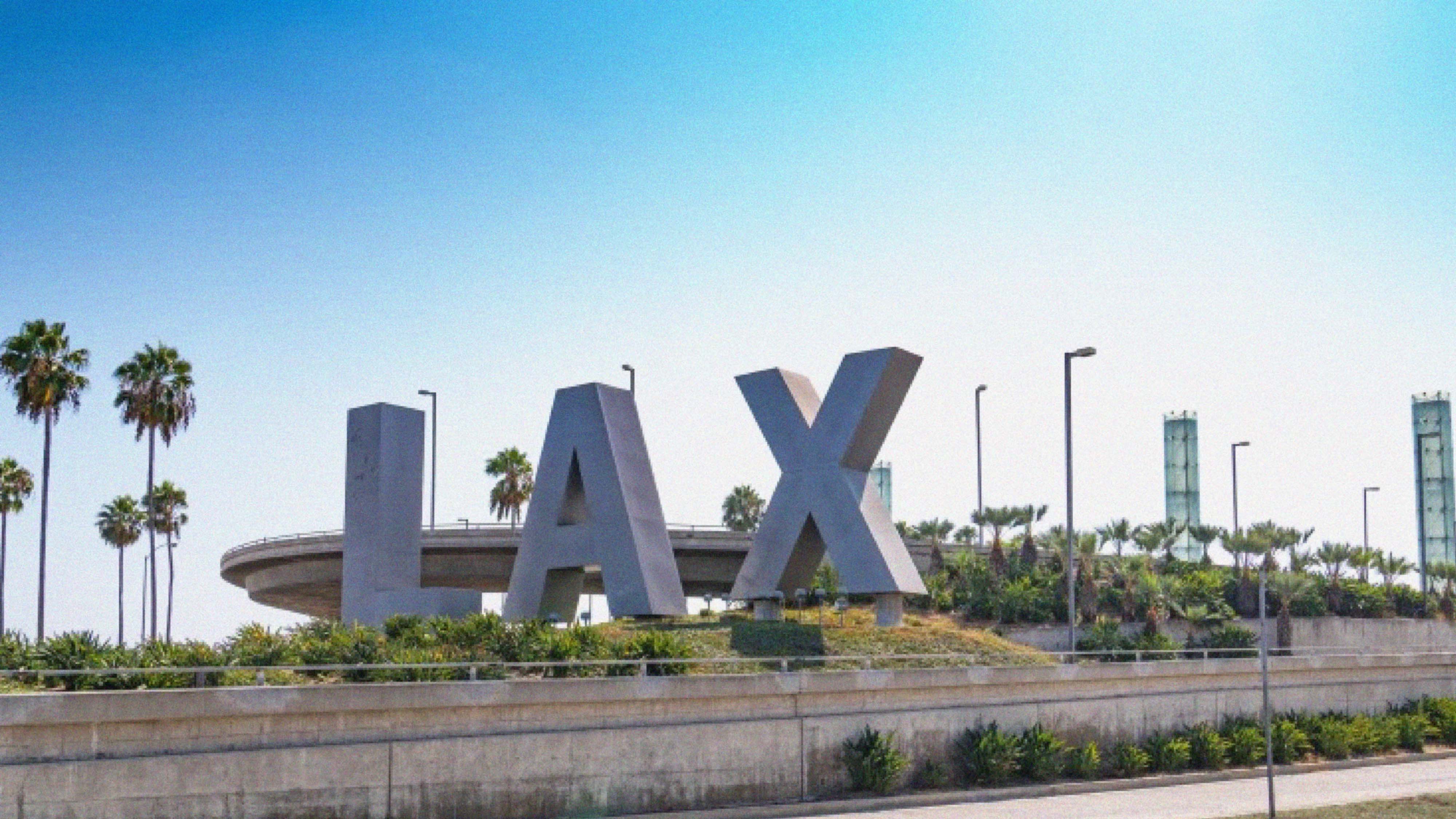
LAX is the second-largest airport in the United States! it is important to have a wonderful first impression for those first-time visitors to LA or the United States. The logo of LAX itself seems unsophisticated and bold, however, the signage systems are however, challenging to comprehend, due to the bulk information congestions. Further, the current logo and signage system are incoherent at this moment.
With this rebranding project, we are applying several visual attributes– simplify, vivid, rounded, accessible, and kinetic, to re-create the vibe in the direction pointing system.
After more than a year in slow motion, the airport's shops and restaurants are now eager to get back to cruising altitude. They needed fresh and positive communications to turn the page of the pandemic.
(challenge)
Boost activity to bring it back to pre-Covid levels by using a universal verbal and visual identity, likely to appeal to the widest possible audience as they walk through the airport.
(thoughts)
LAX is the second-largest airport in the United States! it is important to have a wonderful first impression for those first-time visitors to LA or the United States. The logo of LAX itself seems unsophisticated and bold, however, the signage systems are however, challenging to comprehend, due to the bulk information congestions. Further, the current logo and signage system are incoherent at this moment.
With this rebranding project, we are applying several visual attributes– simplify, vivid, rounded, accessible, and kinetic, to re-create the vibe in the direction pointing system.
(logo)
Since the airport code, "LAX" remains the same with these three letters, but the corners of design are filleted with at a 60-pixels ratio.
![]()
My research in user experiences shows that rounded corners are more effective for maps and diagrams because they allow our eyes to follow lines with ease, “as it suits better to the natural movement of the head and eyes respectively”. Sharp corners throw your eyes off the path of the line, so the viewer end up experiencing abrupt pauses when the line changes direction. With rounded corners, the line leads your eyes around each corner to follow the path smoothly. The main design decision-making is therefore to refine the system within a rounded grid system.
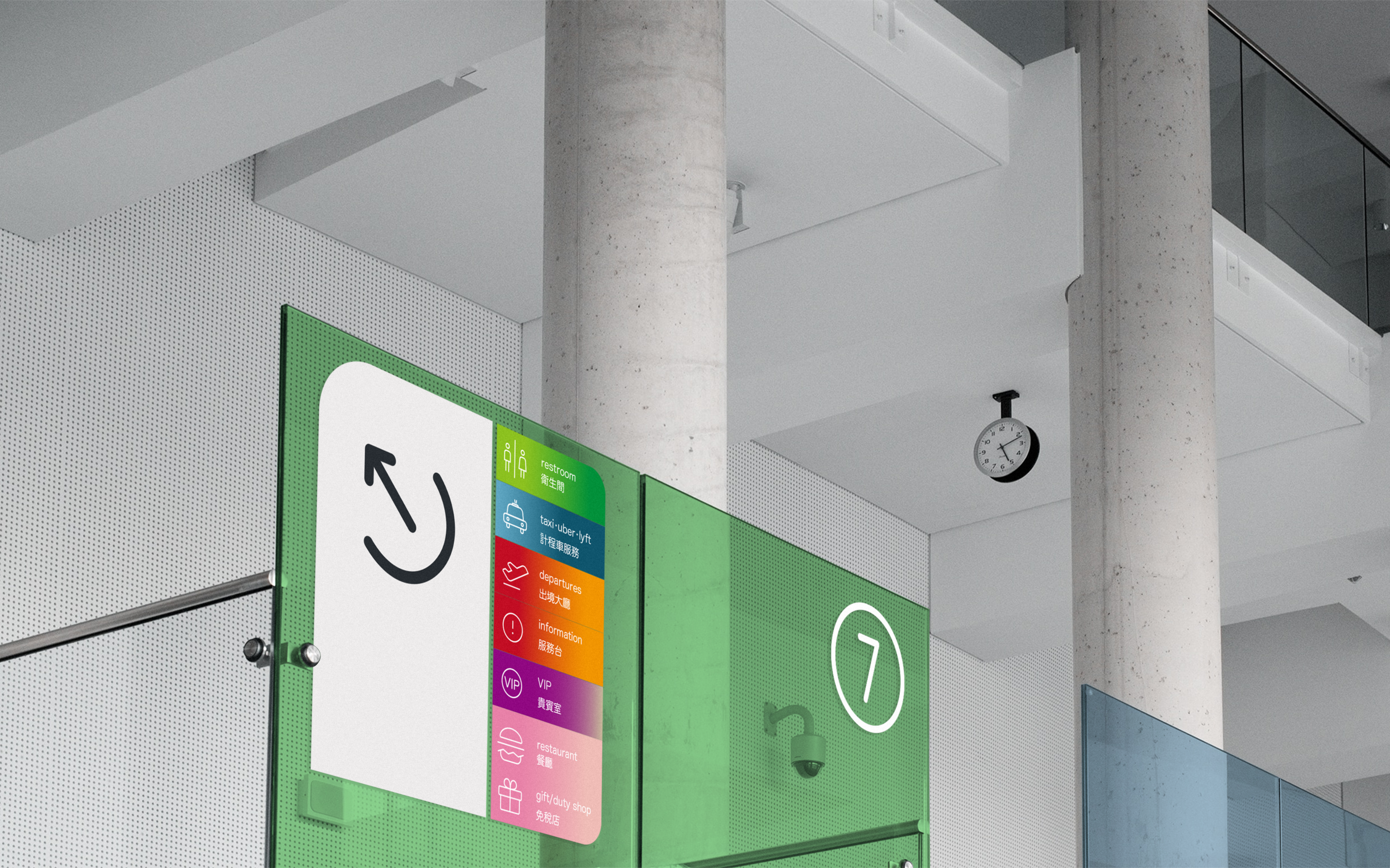
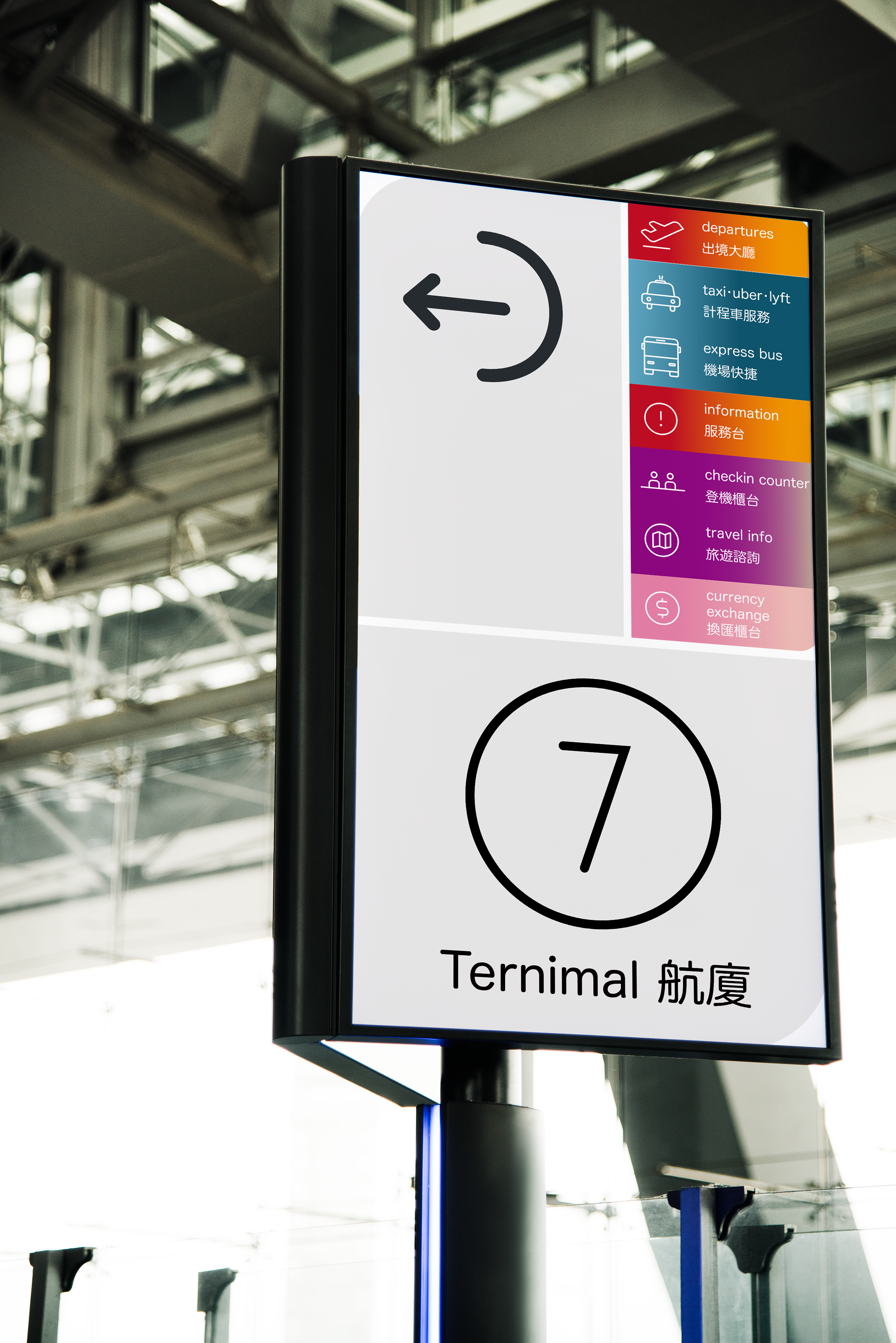
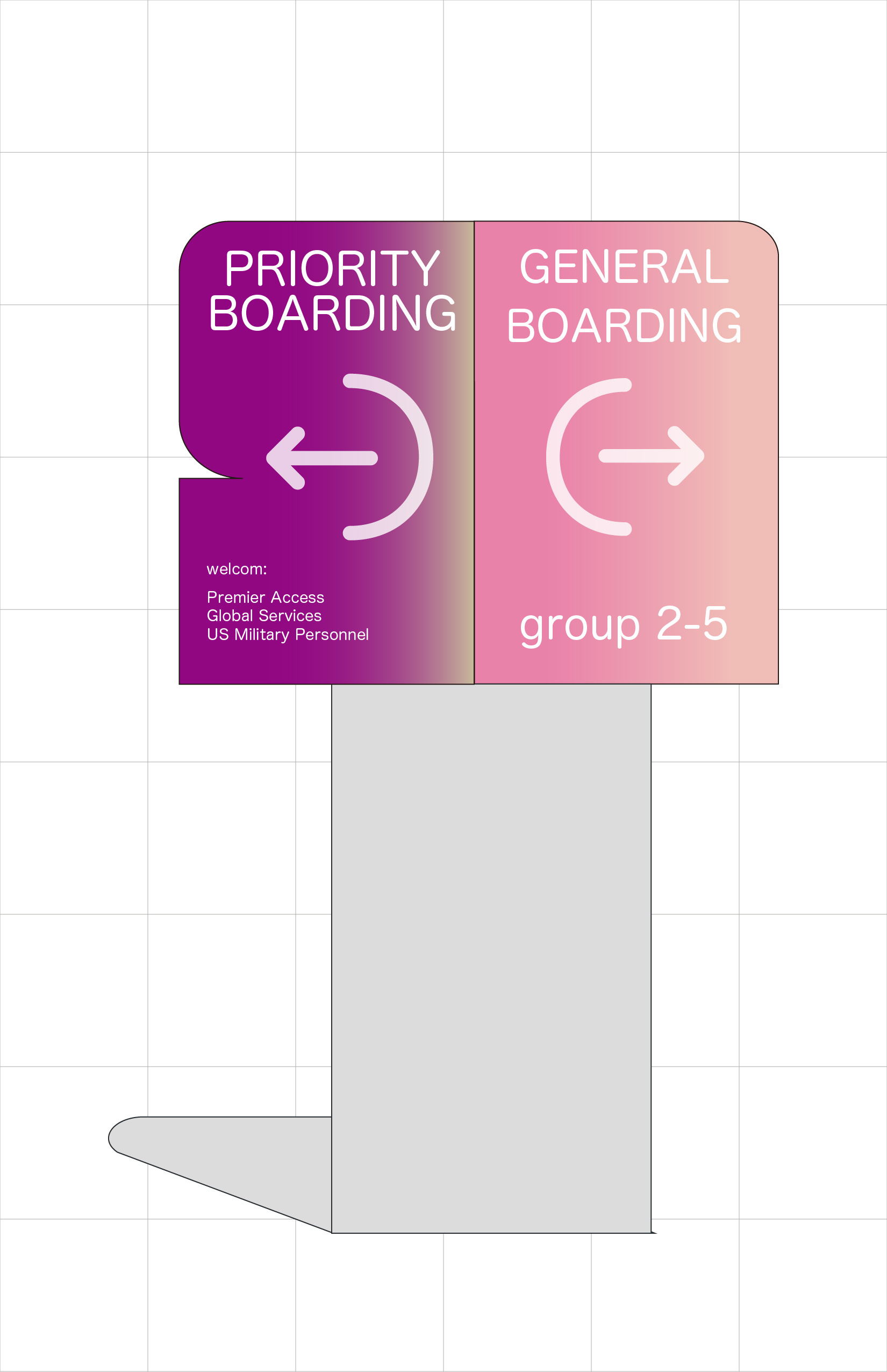
(signage & wayfinding system)
The signage system design is focusing on the five categories: Corporate identity, signage system, moving direction, way finding board, FIDS… (shown below)
![]()
(wayfinding system design)
Wayfinding refers to information systems that guides people through a physical environment, enhancing their understanding and experiences of the space. Wayfinding is particularly important in airports, an utterly complex environment. Travelers needed extremely clear information and directions in order to find their way while traveling. Inspired by Singapore Changi Airport, which possesses systematic colors, typefaces, languages, and structures, that fulfill every traveler around the world.
![]()
![]()
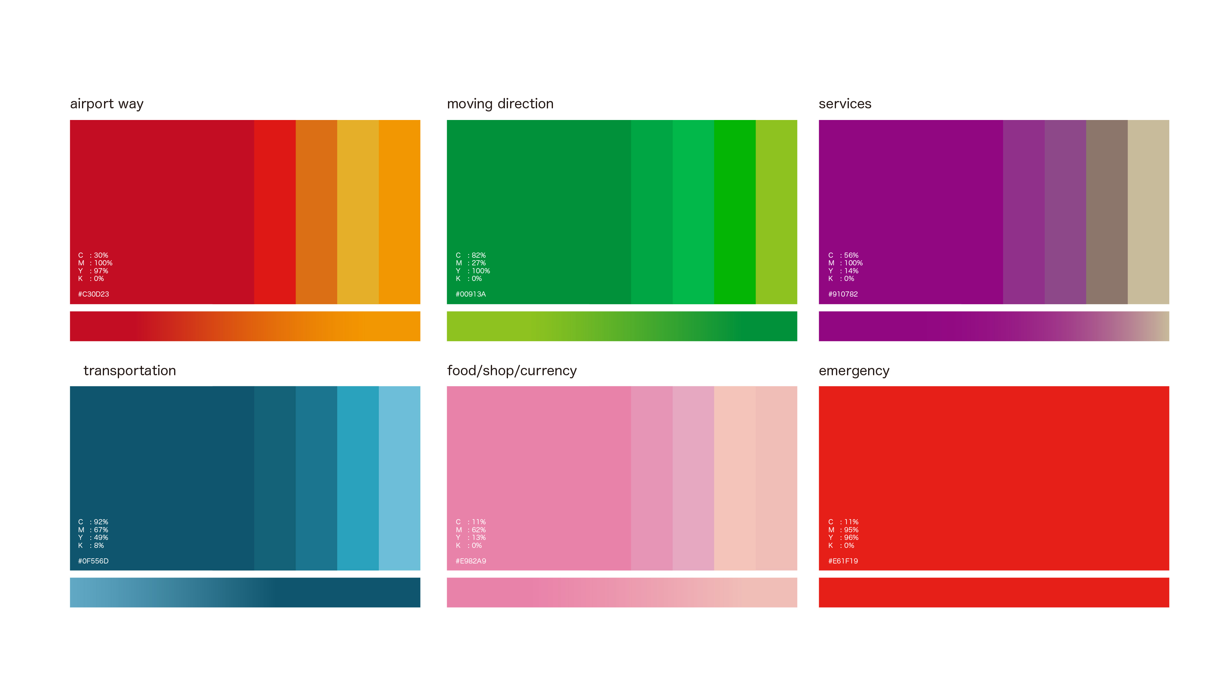
(color system)
![]()
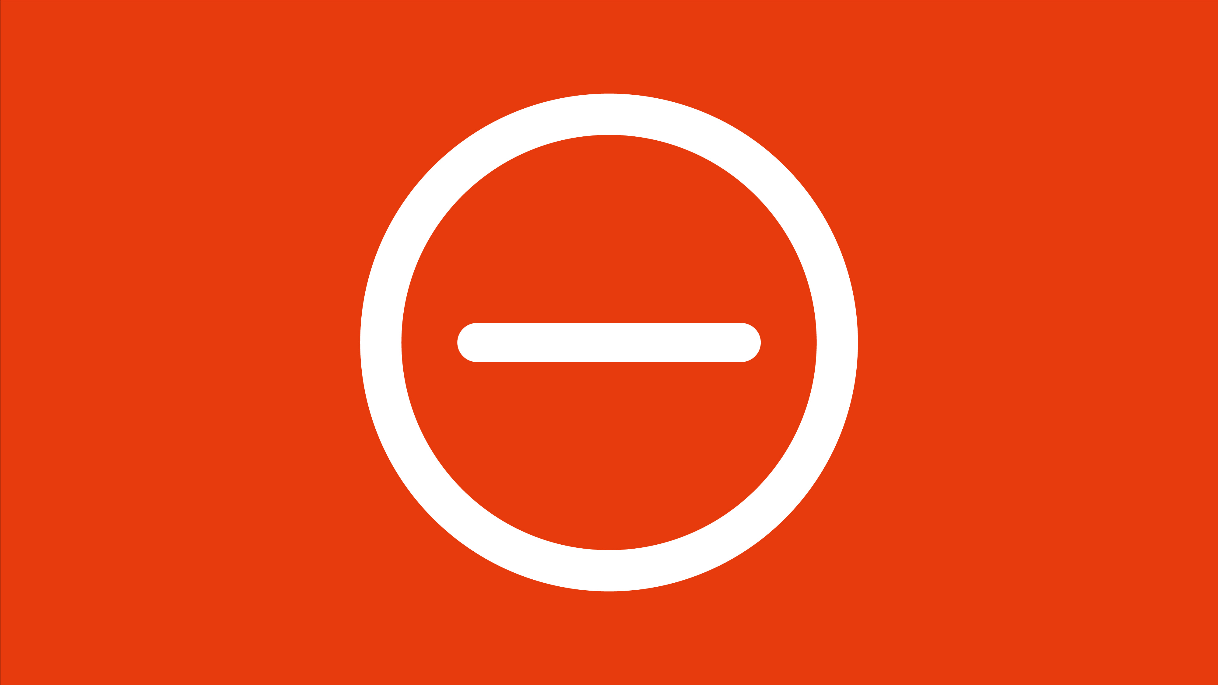
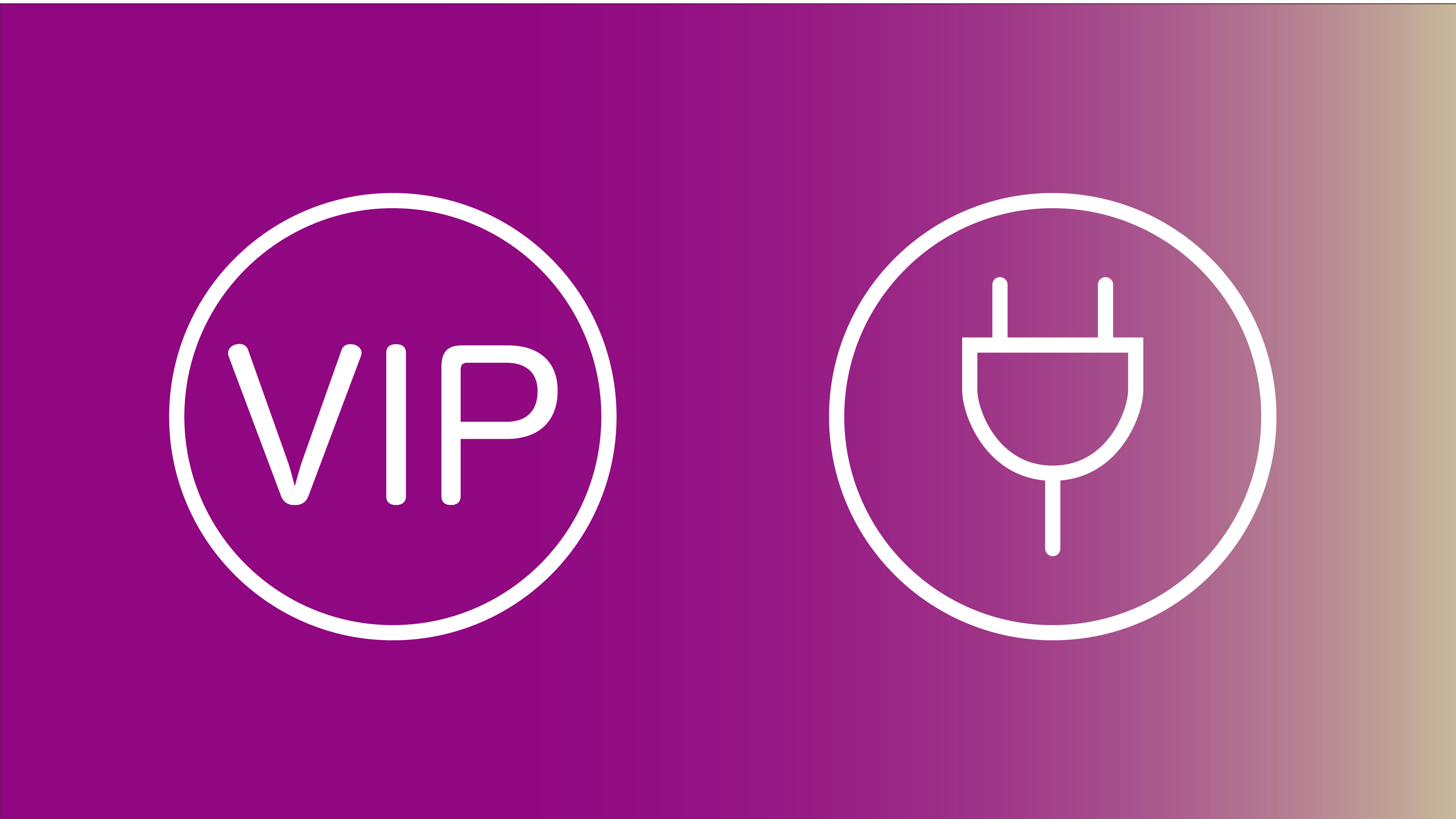
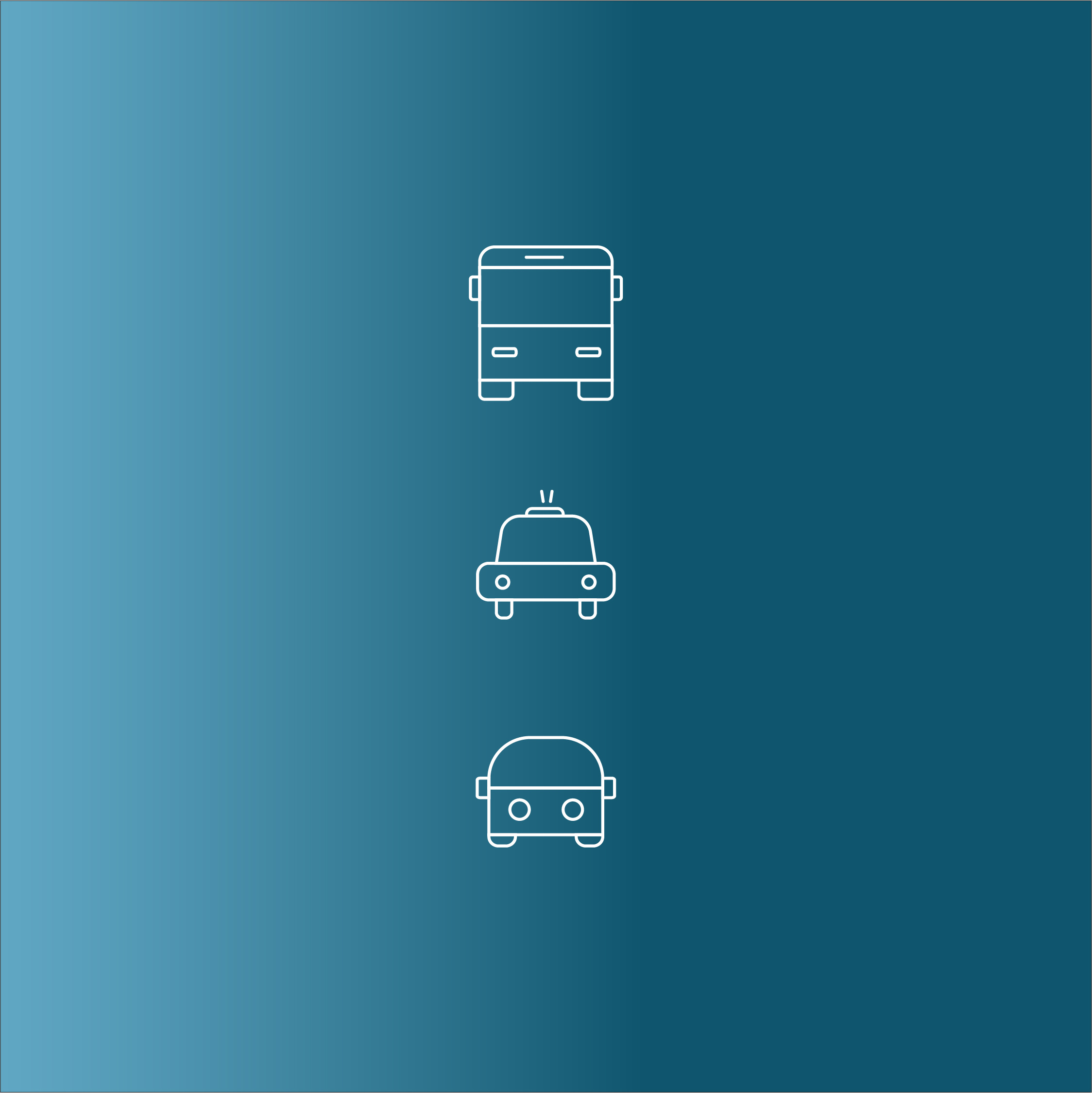
(signage icon design ideas)
![]()
(icon + color usage)
![]()
![]()
![]()
![]()
![]()
![]()
![]()
![]()
![]()
![]()
(wayfinding system)
![]()
![]()
![]()
![]()
![]()
![]()
(magazine)
LAX has no preparation guide for travelers to explore Los Angeles. Releasing a monthly magazine as an Airport Guide will be ideal for those travelers. The content could be presenting a monthly picked attraction, food, culture, or region. The magazine could be delivered in digital versions within the Mobile Application or have them handy while checking in on the flight as well.![]()
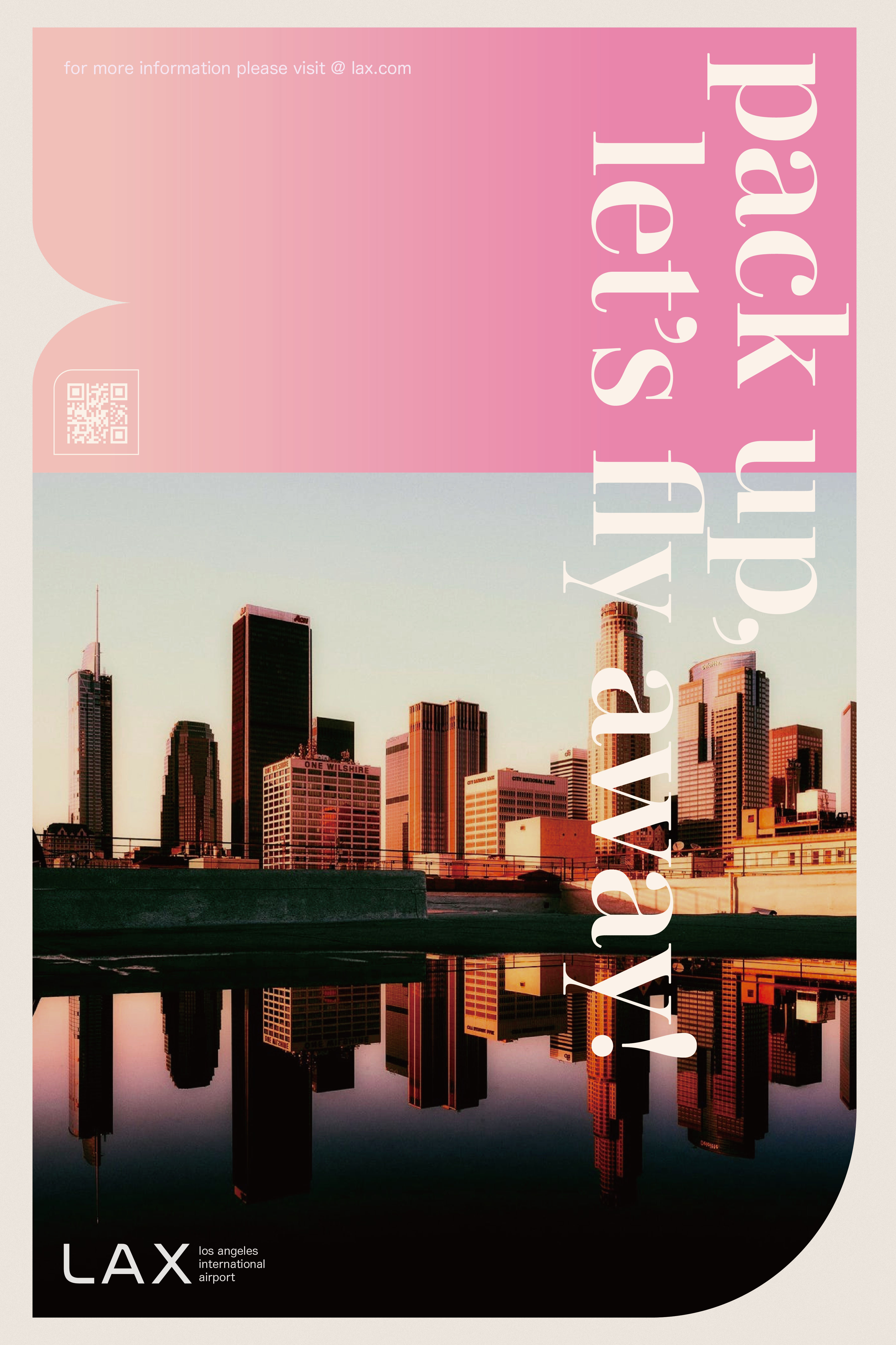
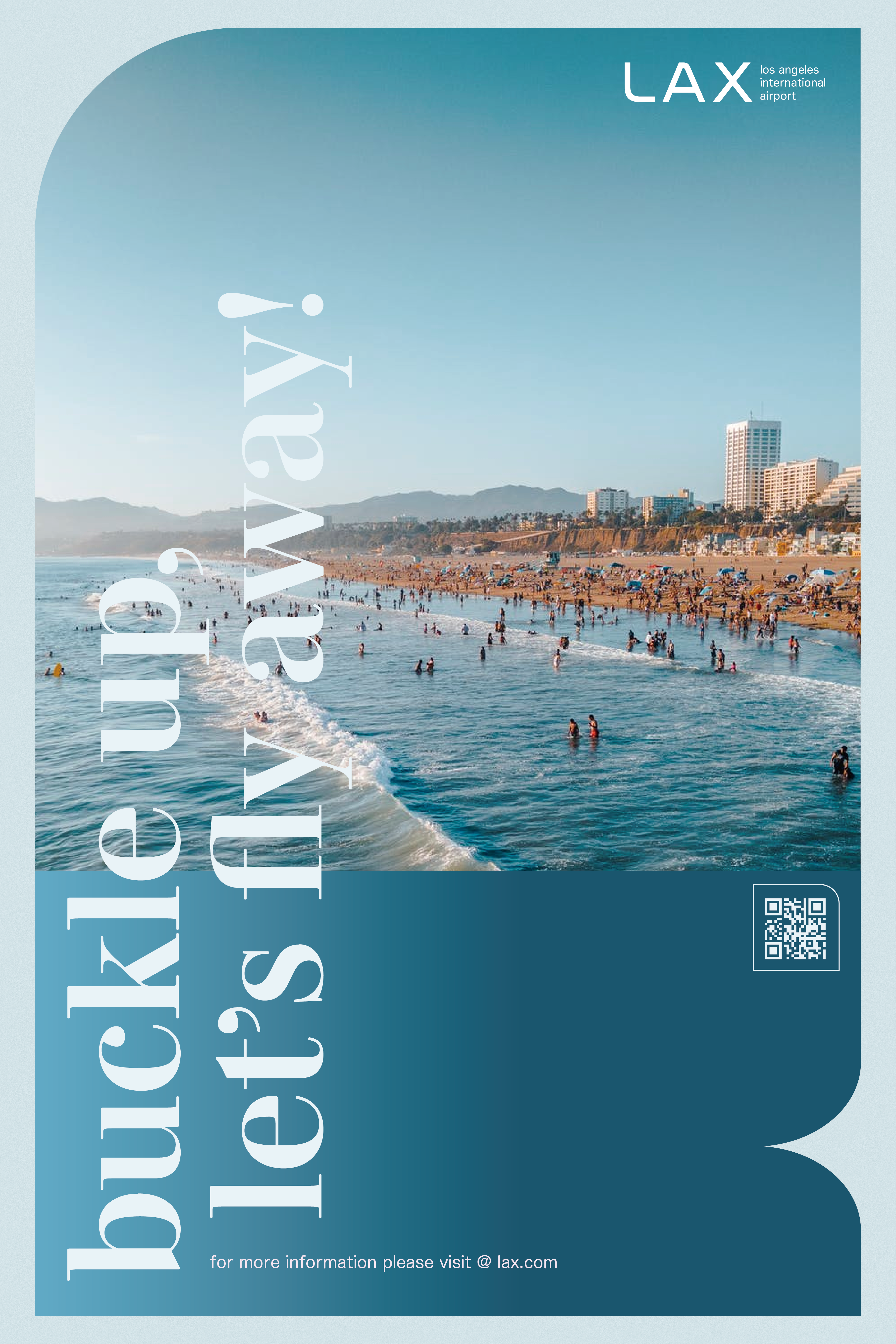
(promotional poster)
![]()
![]()
![]()
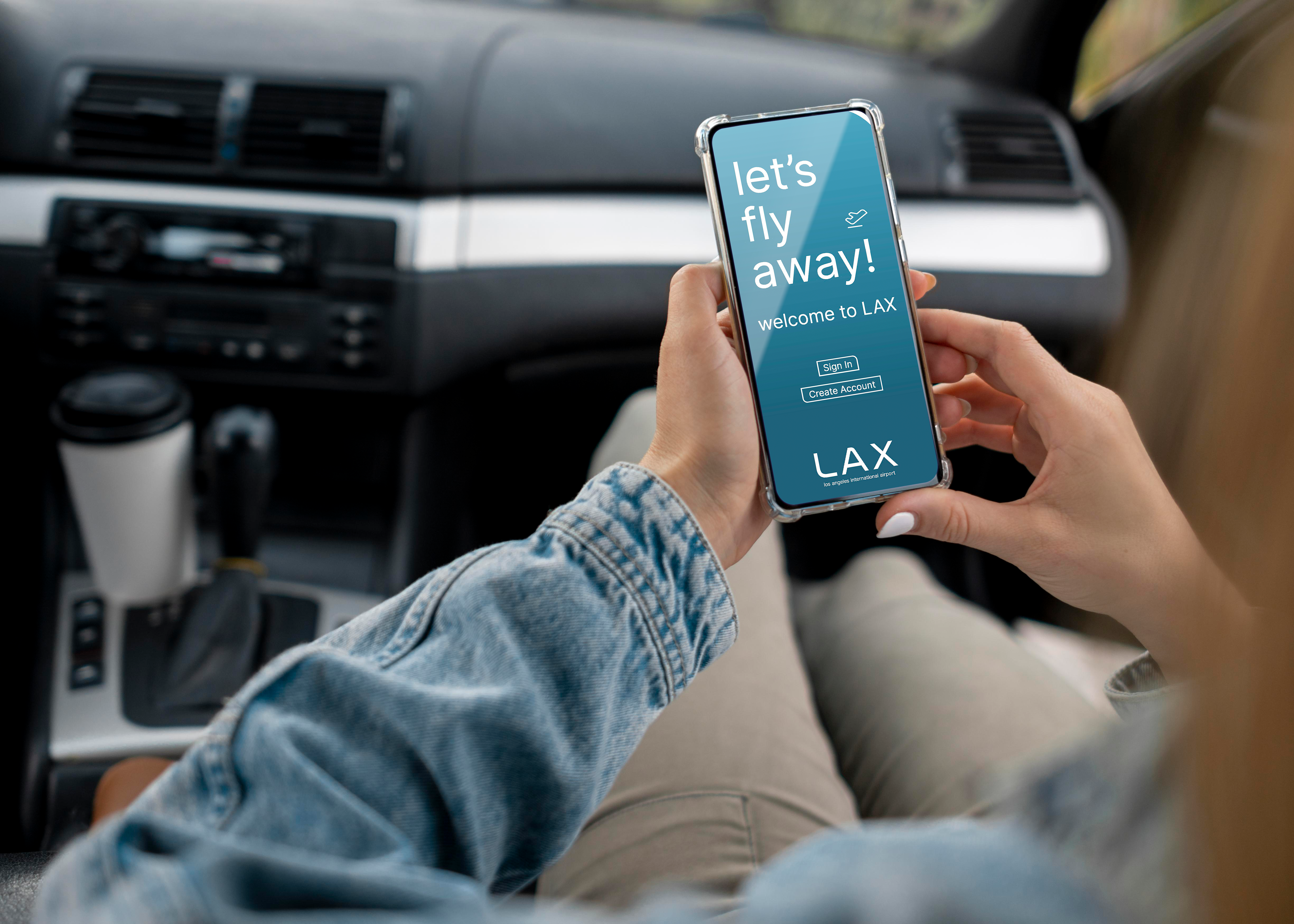
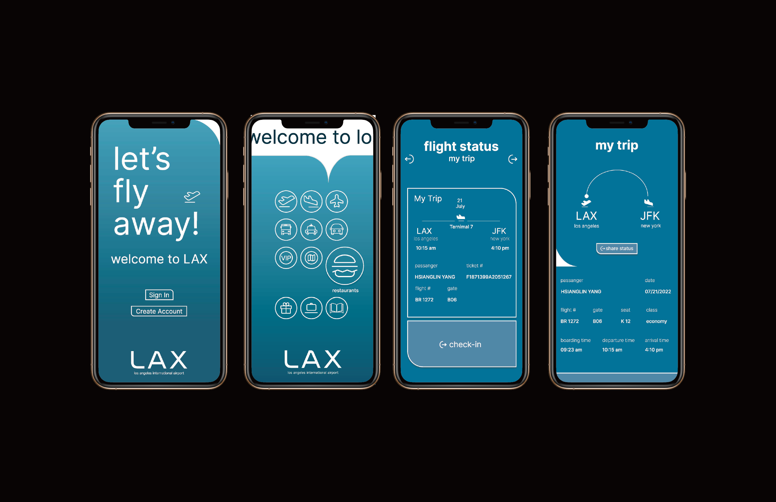
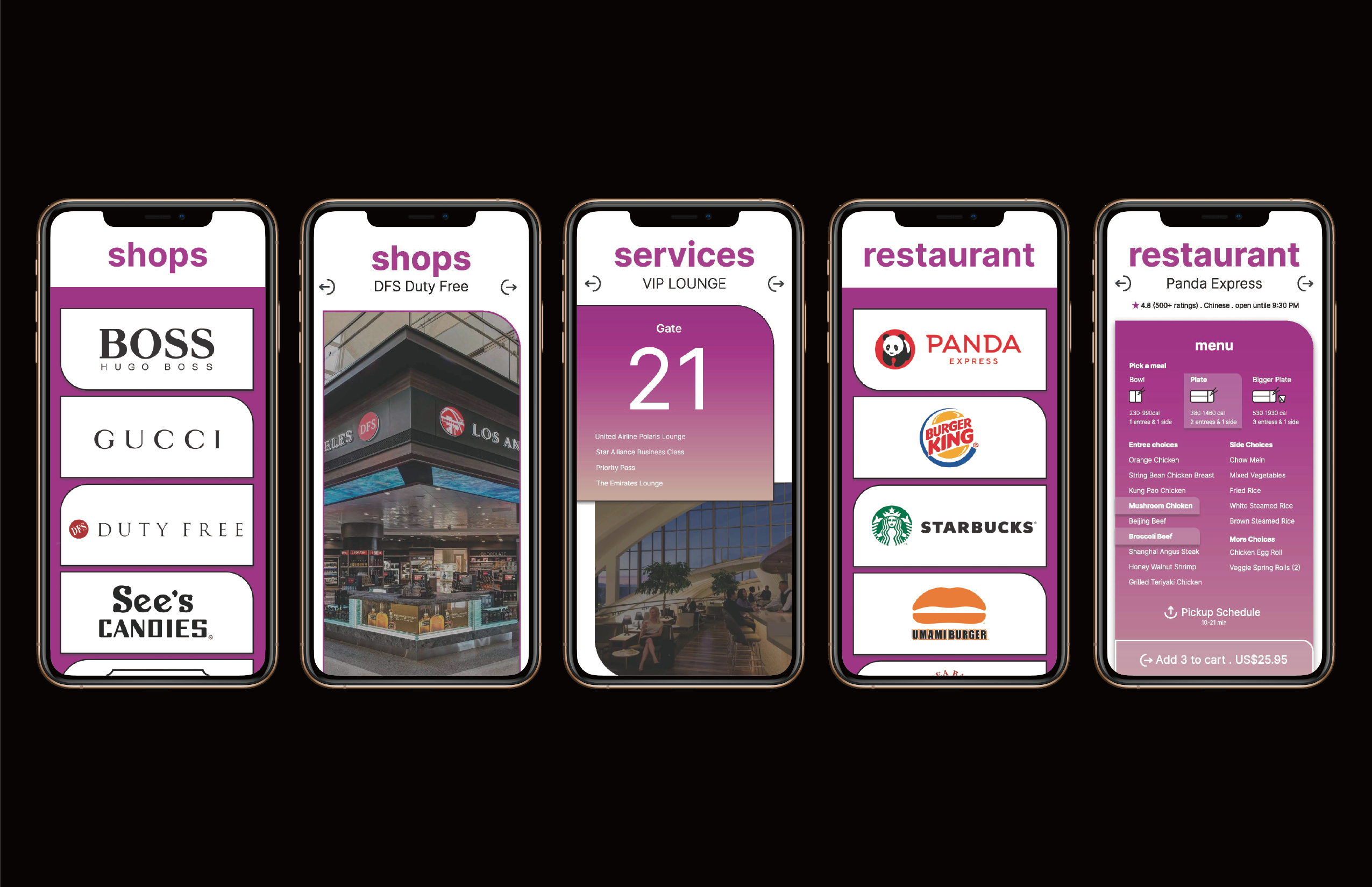
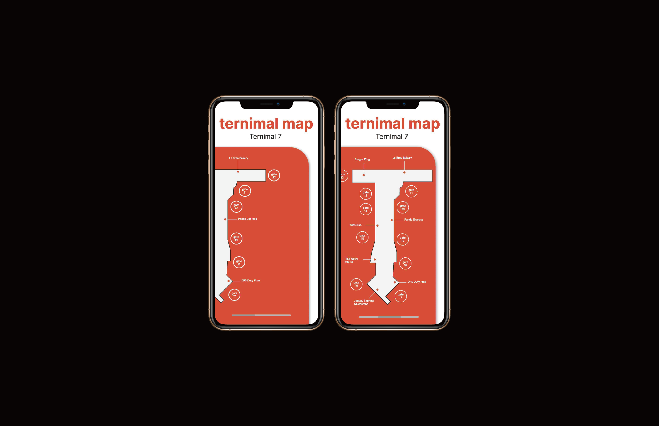
(mobile application)
LAX doesn't have a dedicated Mobile Application for travelers. It could be more convenient for travelers to access information, such as terminal maps, public transportation, parking, transit, baggage claim and etc. through specialized mobile applications.
![]()
![]()
![]()
![]()
![]()
![]()
Since the airport code, "LAX" remains the same with these three letters, but the corners of design are filleted with at a 60-pixels ratio.

My research in user experiences shows that rounded corners are more effective for maps and diagrams because they allow our eyes to follow lines with ease, “as it suits better to the natural movement of the head and eyes respectively”. Sharp corners throw your eyes off the path of the line, so the viewer end up experiencing abrupt pauses when the line changes direction. With rounded corners, the line leads your eyes around each corner to follow the path smoothly. The main design decision-making is therefore to refine the system within a rounded grid system.
(signage & wayfinding system)
The signage system design is focusing on the five categories: Corporate identity, signage system, moving direction, way finding board, FIDS… (shown below)

(wayfinding system design)
Wayfinding refers to information systems that guides people through a physical environment, enhancing their understanding and experiences of the space. Wayfinding is particularly important in airports, an utterly complex environment. Travelers needed extremely clear information and directions in order to find their way while traveling. Inspired by Singapore Changi Airport, which possesses systematic colors, typefaces, languages, and structures, that fulfill every traveler around the world.
(color system)
(signage icon design ideas)

(icon + color usage)


(wayfinding system)


(magazine)
LAX has no preparation guide for travelers to explore Los Angeles. Releasing a monthly magazine as an Airport Guide will be ideal for those travelers. The content could be presenting a monthly picked attraction, food, culture, or region. The magazine could be delivered in digital versions within the Mobile Application or have them handy while checking in on the flight as well.

(promotional poster)

(mobile application)
LAX doesn't have a dedicated Mobile Application for travelers. It could be more convenient for travelers to access information, such as terminal maps, public transportation, parking, transit, baggage claim and etc. through specialized mobile applications.