____ OF CONTEMPORARY ART
︎︎︎publication
︎︎︎exhibition
︎︎︎identity
︎︎︎spatial
︎︎︎social media design
︎︎︎motion design
____ OF CONTEMPORARY ART is a hypothetical branding project for launching a contemporary art institution that features Asia contemporary art, bringing Asia into the global dialogue. The institution is committed to the belief that art can deepen humans’ lives and transcend boundaries. Meanwhile, the institution will present a wide range of exhibitions and public programs that features Asia contemporary art, or holding events/workshops across different locations.
(thoughts)
In the awareness of international art and design educational purposes, I concentrated on the idea of “creating global dialogue” and an “authentic story” in this project development. Inspired by the two artists, Xu Bing, and Tadao Ando from their philosophy: embracing every fragment in life and its' personality. They expanded my horizon, sparking off ideas, to creating this brand which is deepening in the scope of lives and transcending boundaries through contemporary art.
(logo)
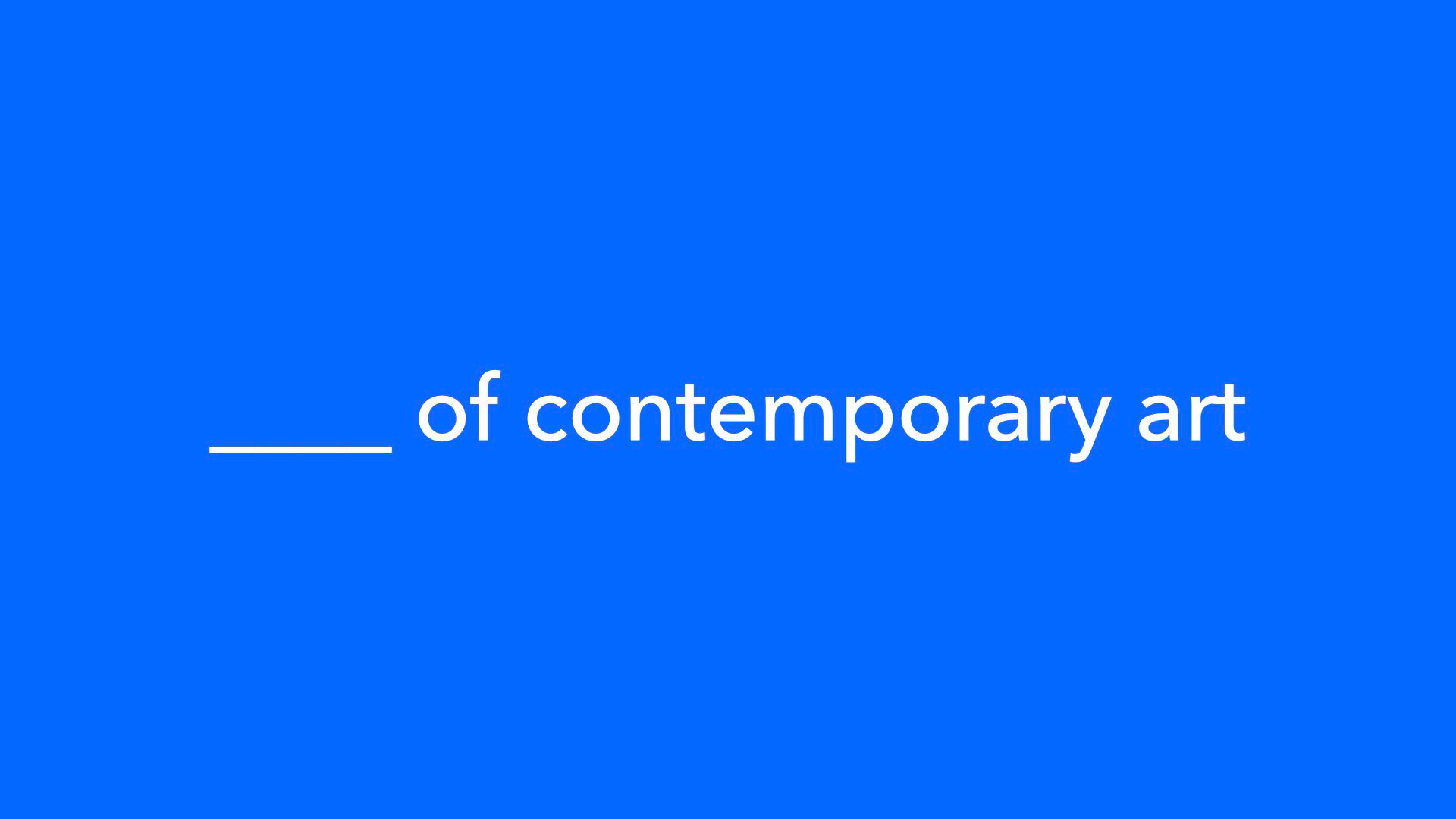
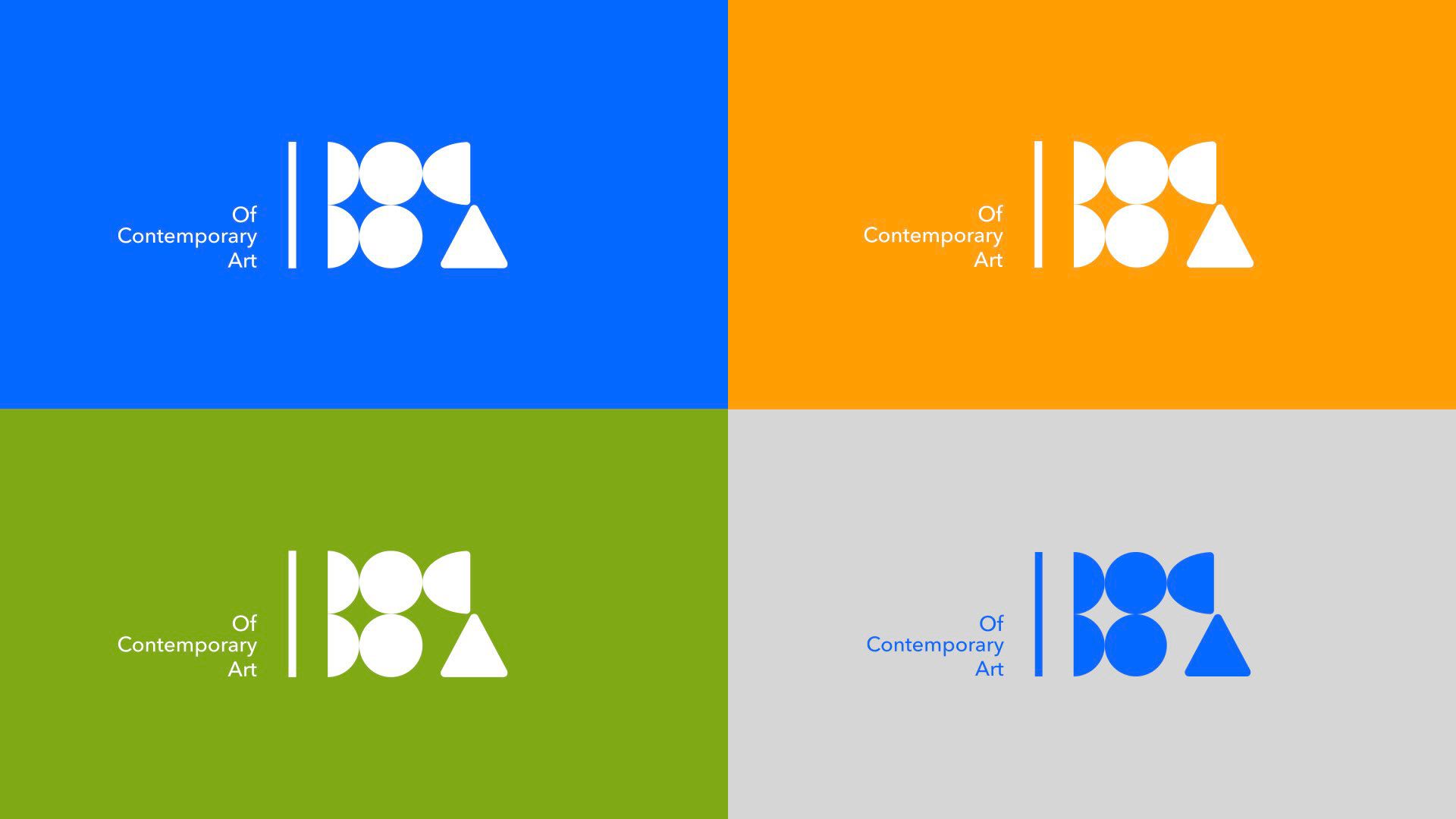
The concept of this art institution is to engage the local community and bring Asia into the global dialogue; "____ " is designed for audiences to define and fill in the blank with what they have received and perceived from the institution. The decision of conceptualizing the logo into a geometric shape was inspired by Tadao Ando's uses of geometry, both to study and divide space as well as to draft detailed building plans.
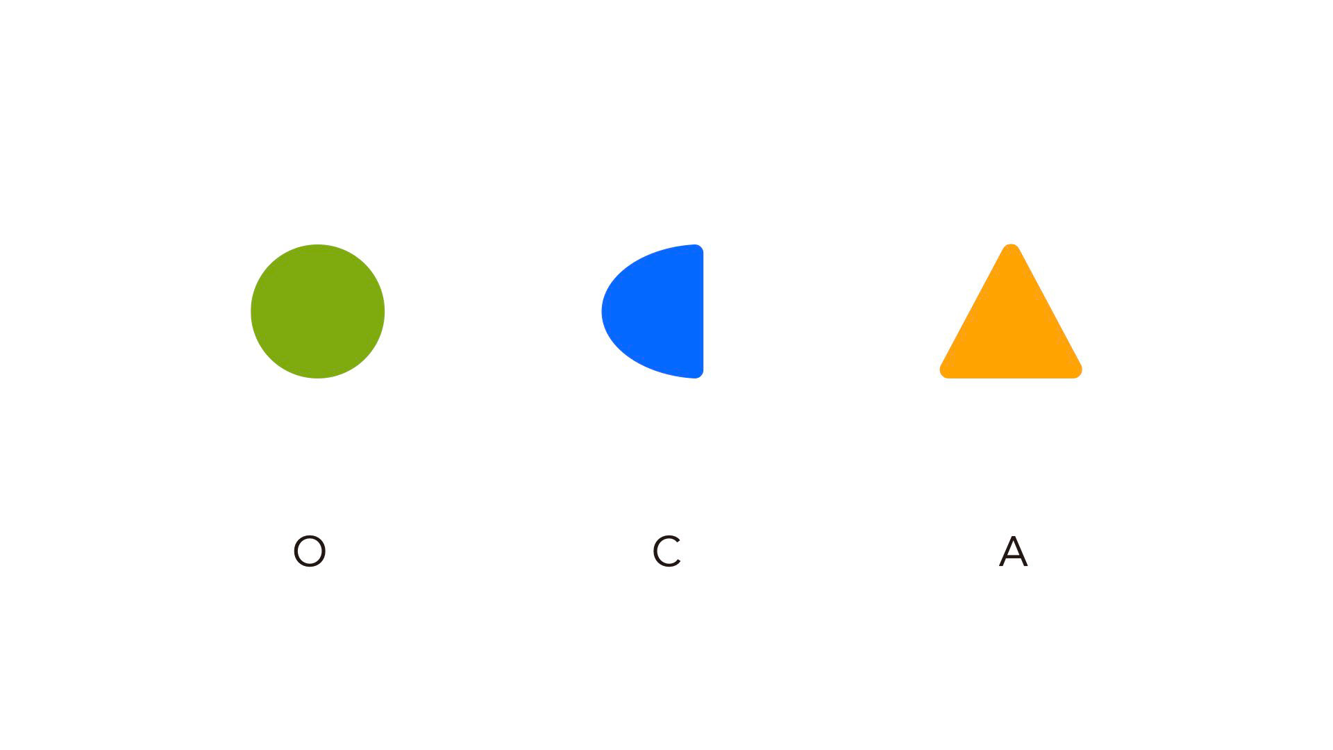
Of Contemporary Art is also known as a shorter letterform of OFCA. We translated a written logotype into geometric form and have the underline rotated by 90 degrees. The form itself is not only used as the symbol of the brand, it is also used to symbolize different locations: Beijing, Los Angeles, and Shanghai.

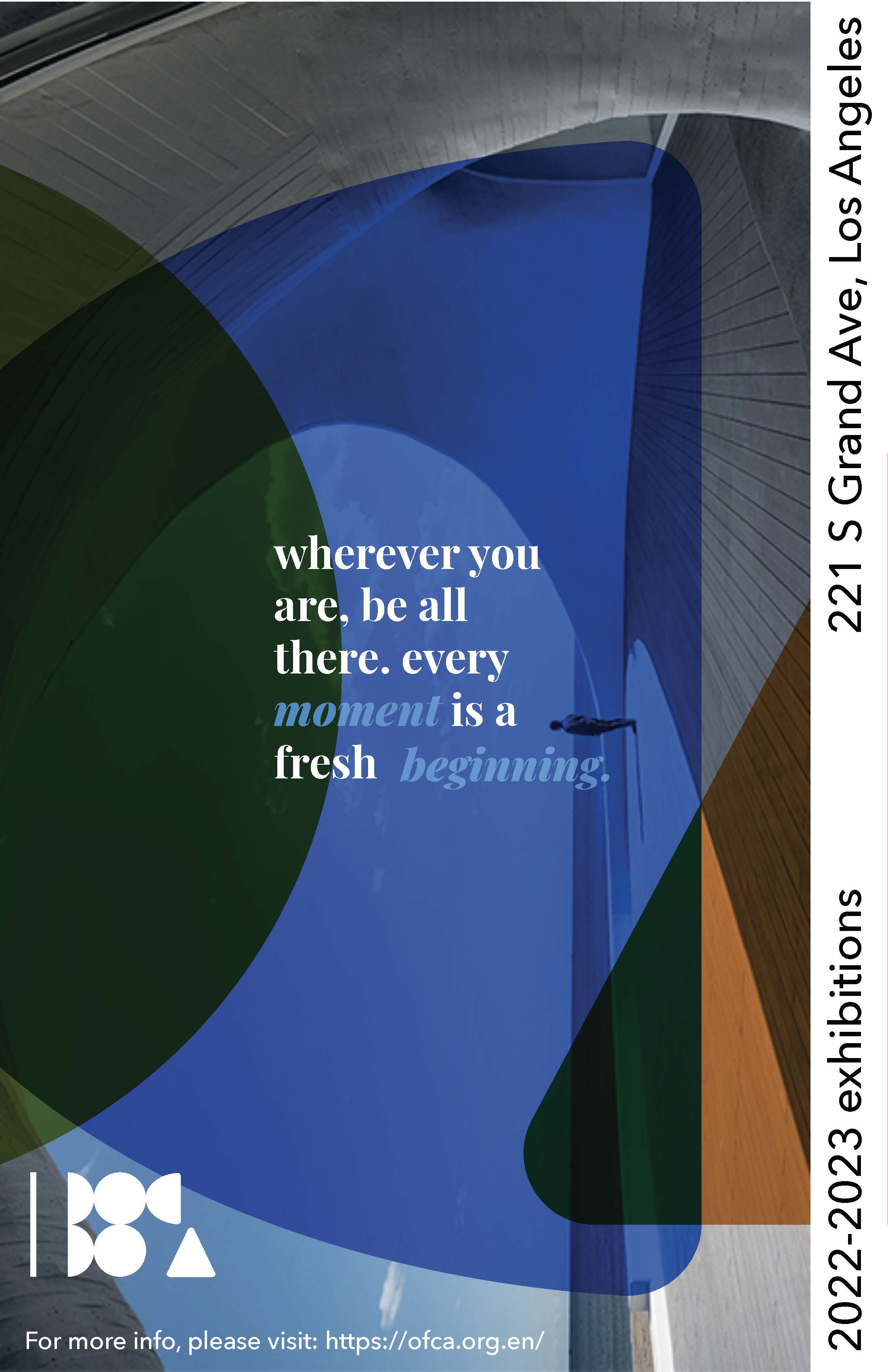
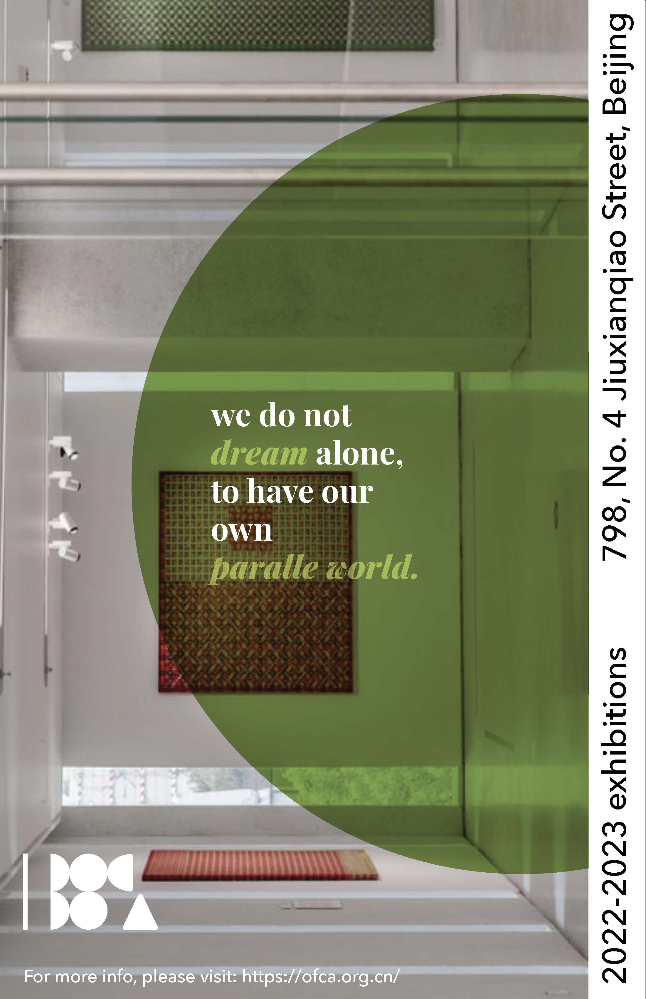
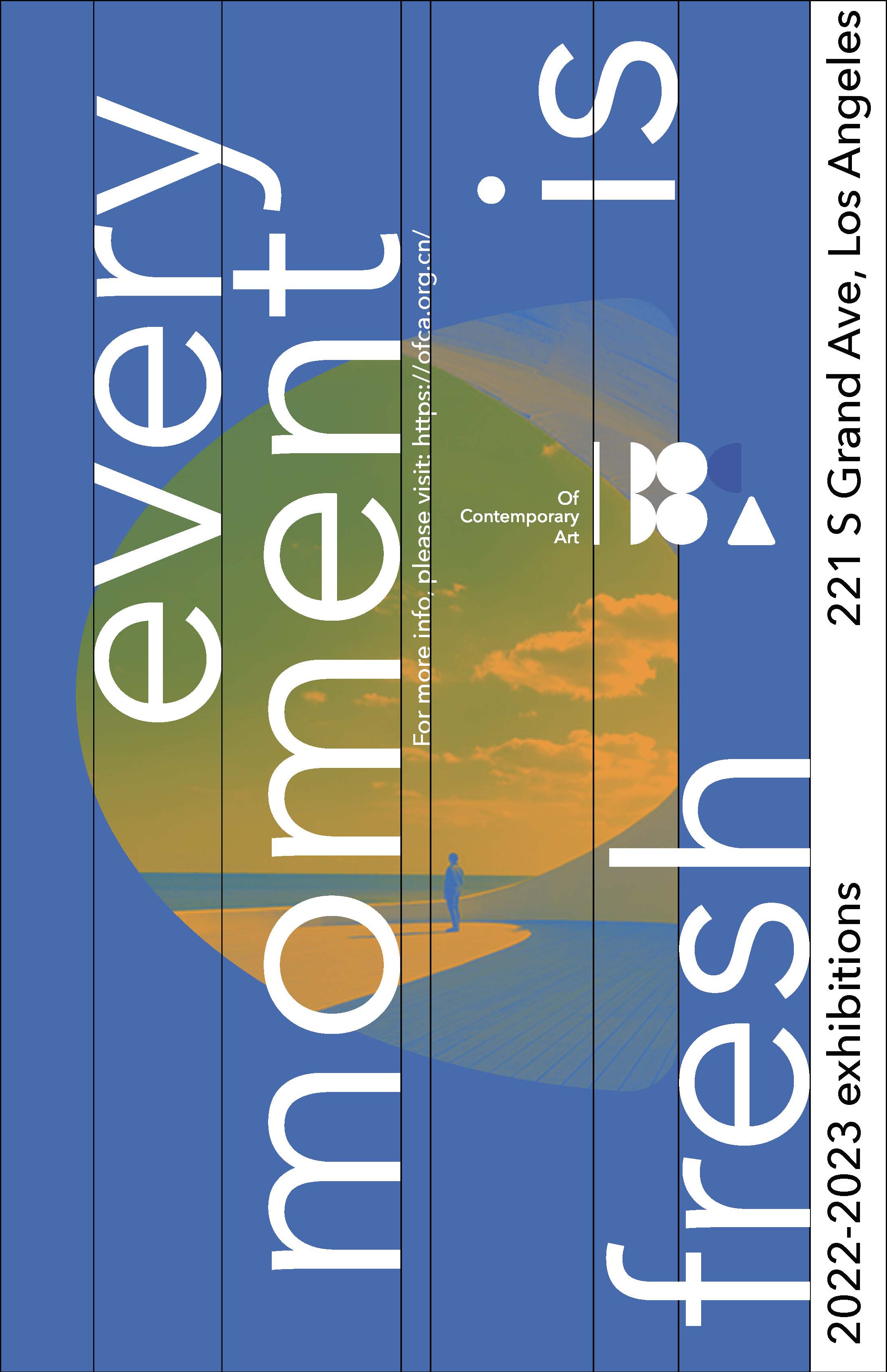
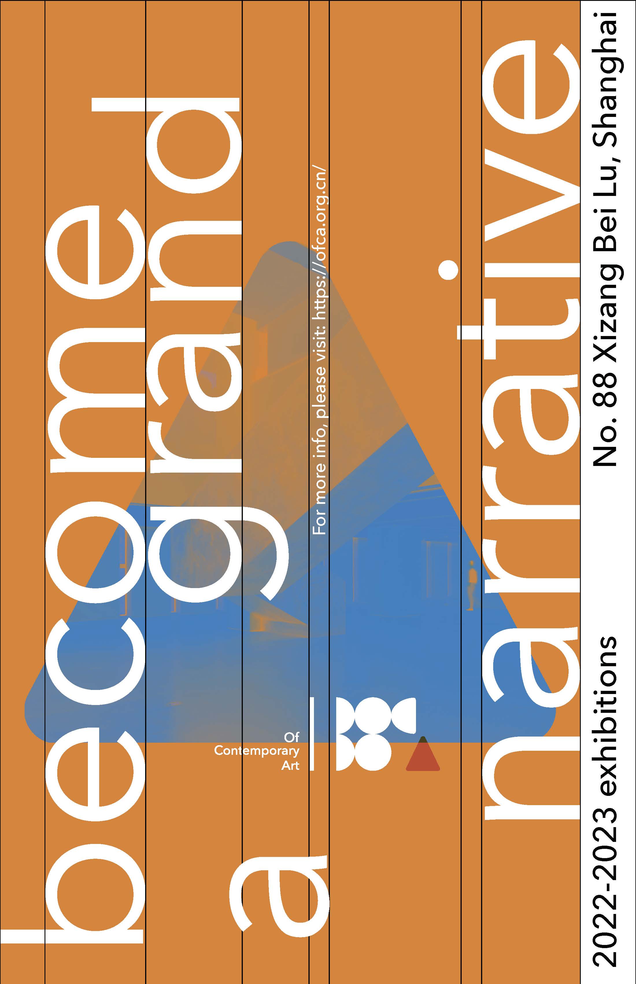
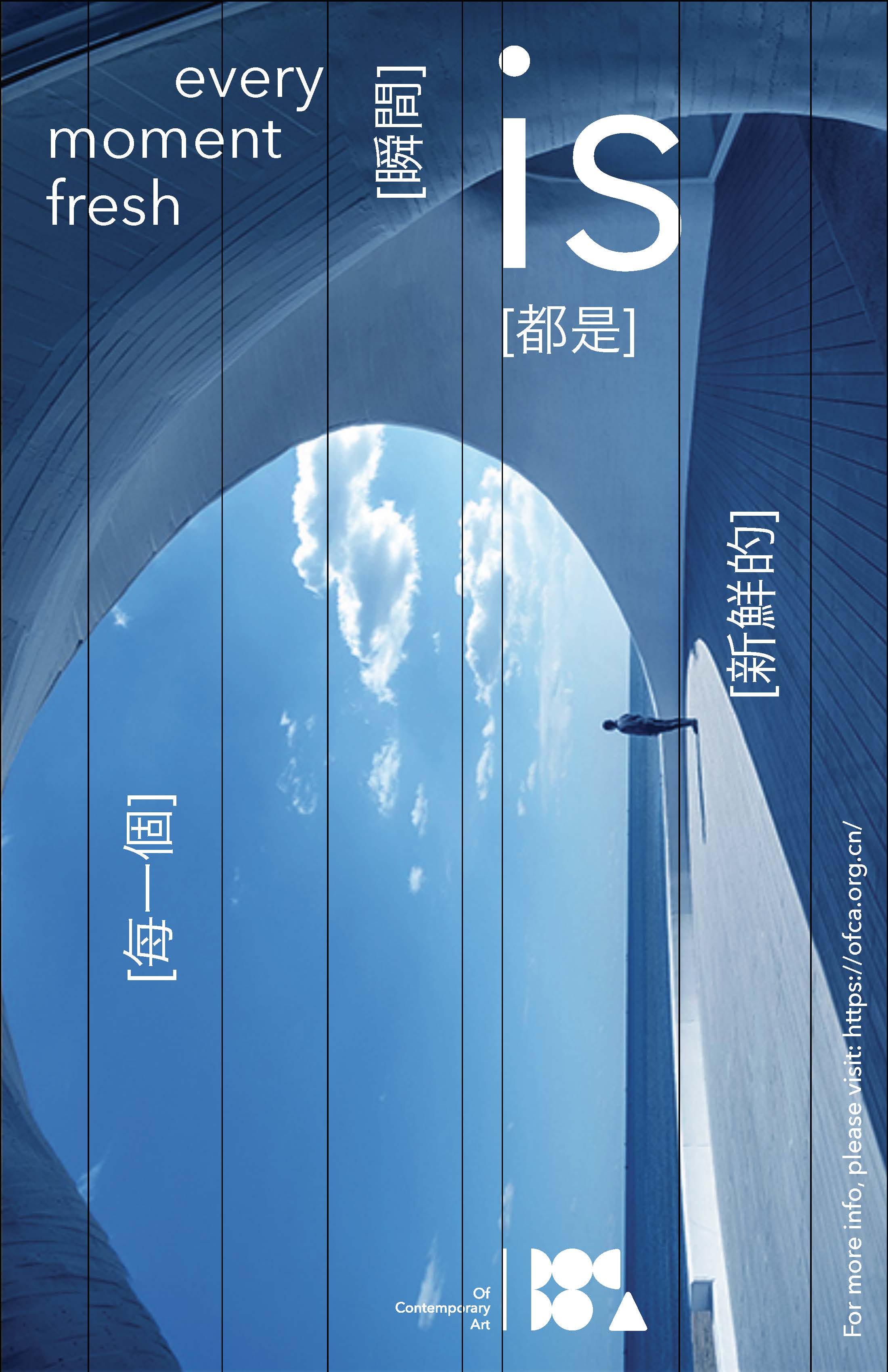
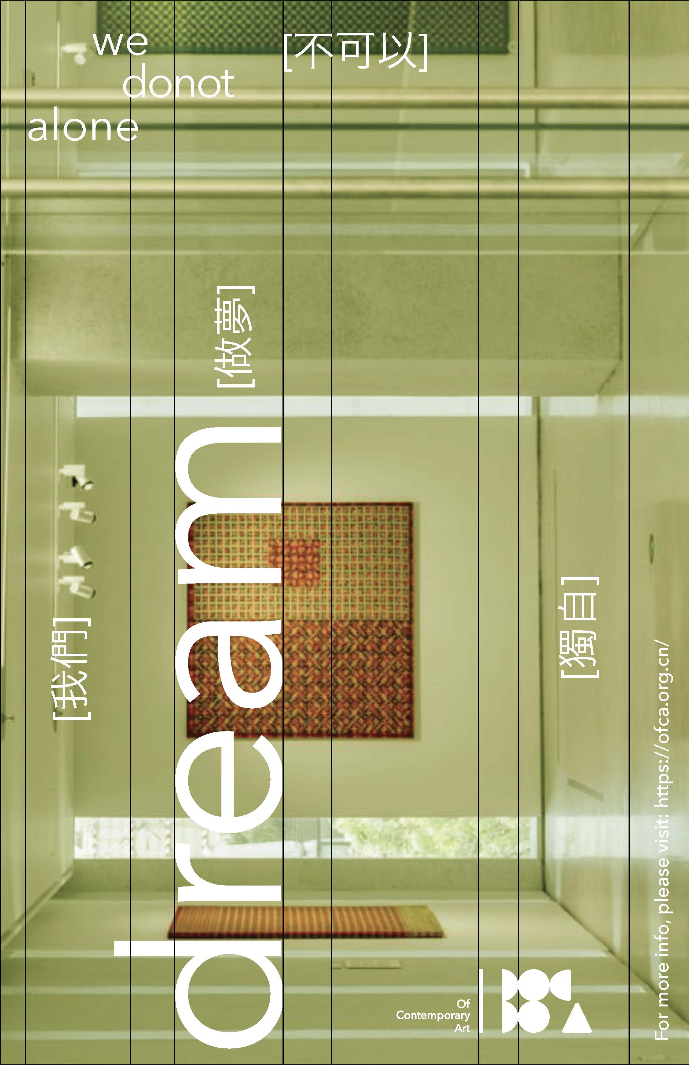
(identity poster series)
The identity posters applied a consistent graphic language of expanding lines and shapes. Inspirational quotes are enlarged and capitalized to highlight the excitement of learning.



(giveaway swag ideas)
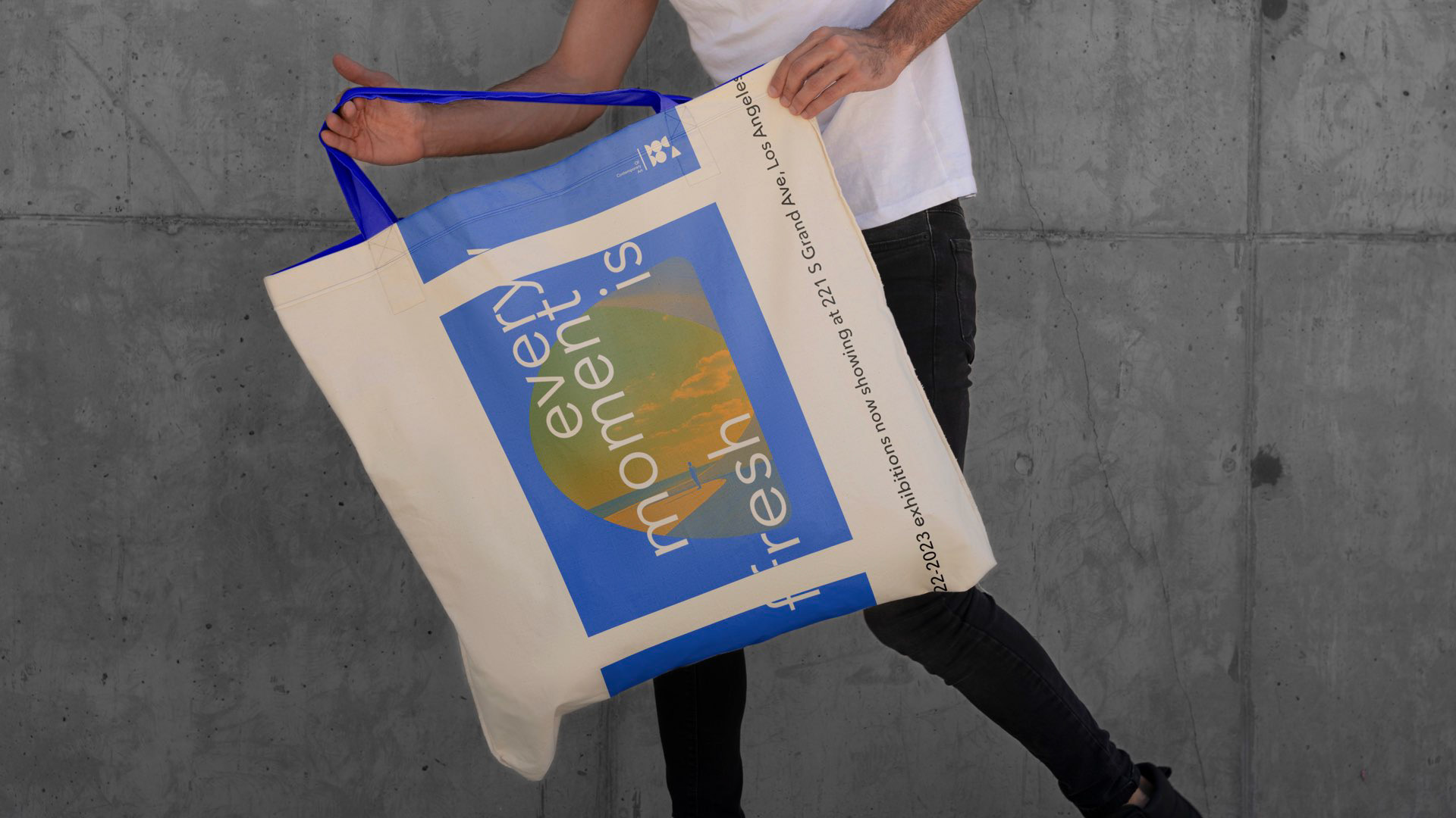
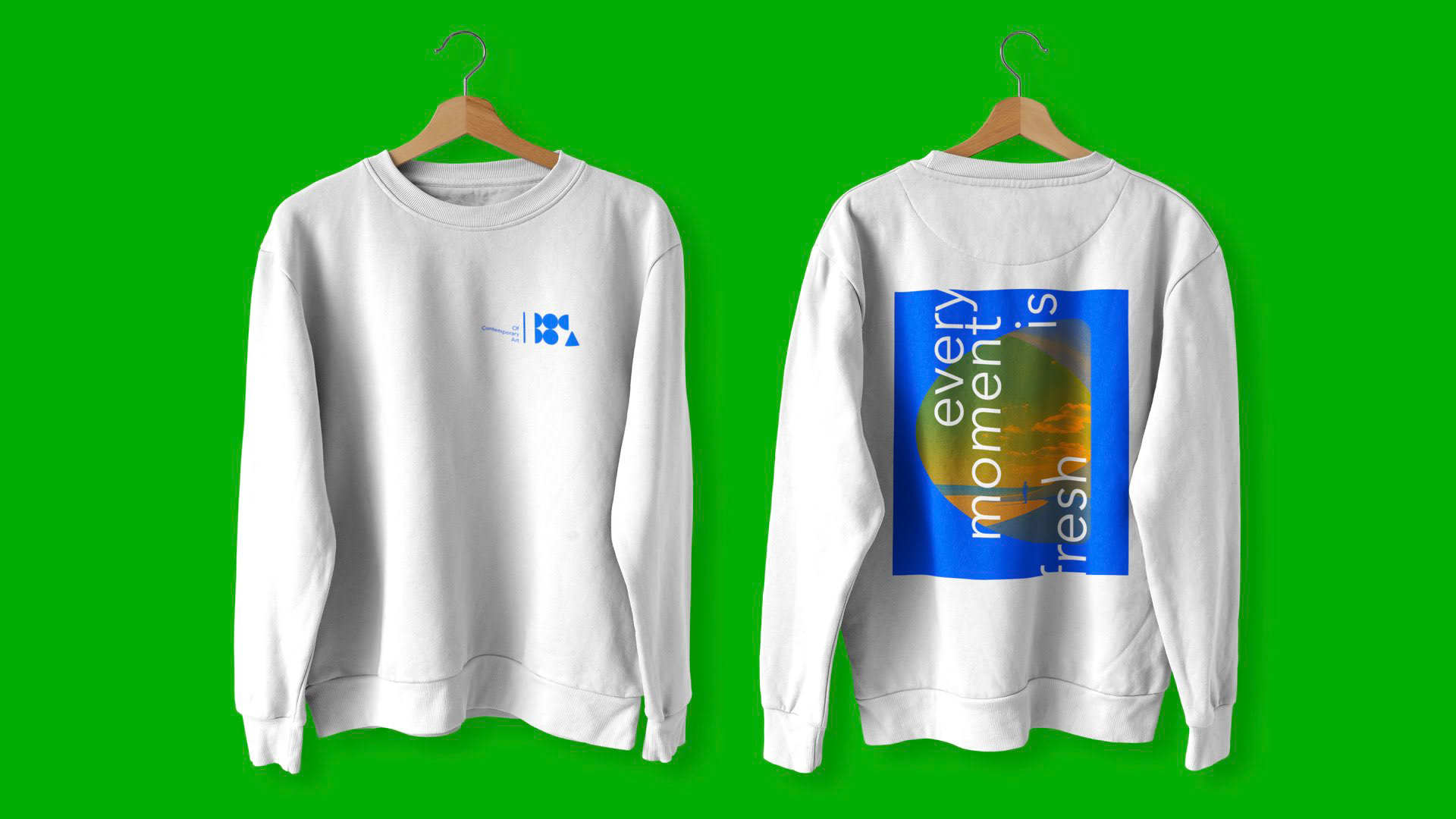
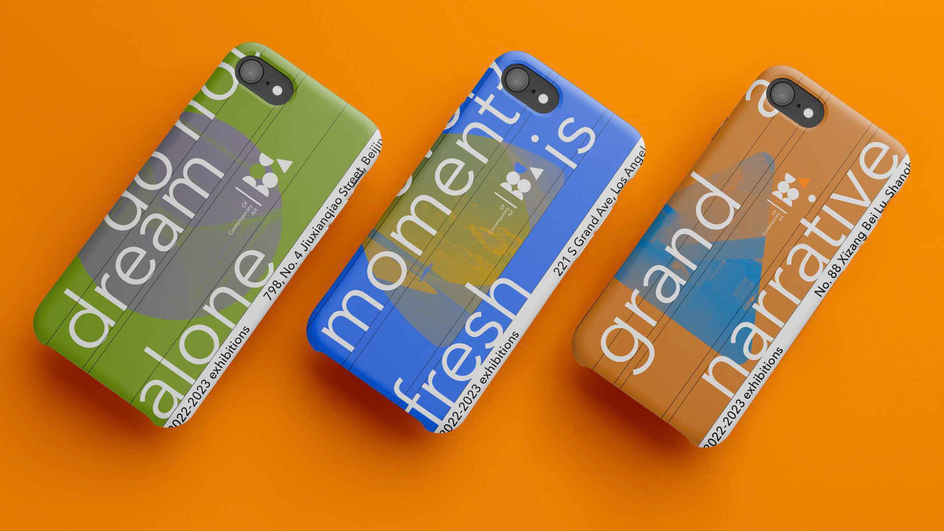
Including a tote bag, water bottle, museum tickets, seasonal catalog, phone cases, and t-shirt



(outdoor strategy)
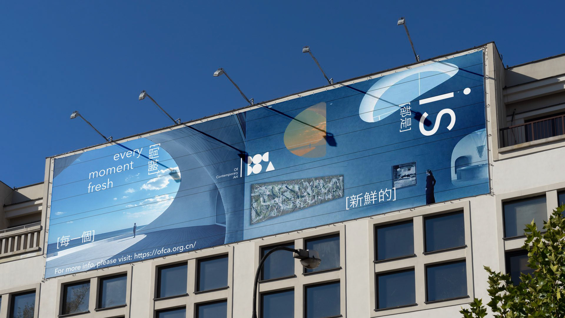
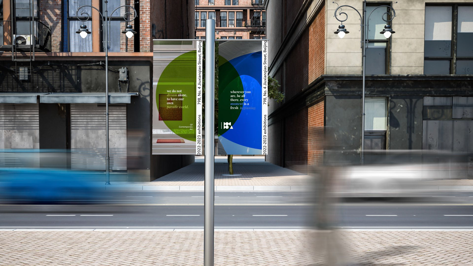
OFCA will spread brand awareness through mass marketing campaigns. Since OFCA collaborates with public and academic institutions, its target audience would be the general public but specifically those who might have an interest in contemporary arts. The outdoor strategy aims to spread brand awareness, as well as improve the city branding of the target cities. We will be focusing on public spaces where people casually go to or pass by.

(social media)
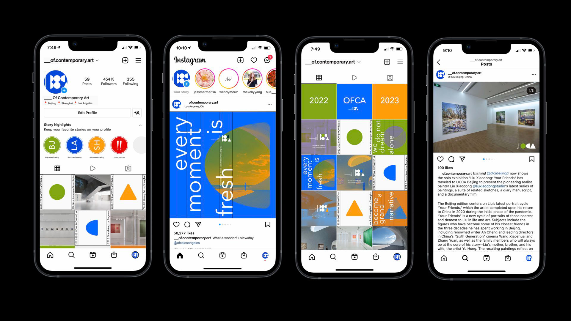
Instagram is the selected platform to promote OFCA. It is able to emphasize key events, while being image-based using compelling moments in art in order to connect to users at first sight, with a playful touch. The Instagram page focuses on establishing connections to an engaging community.

(publication)
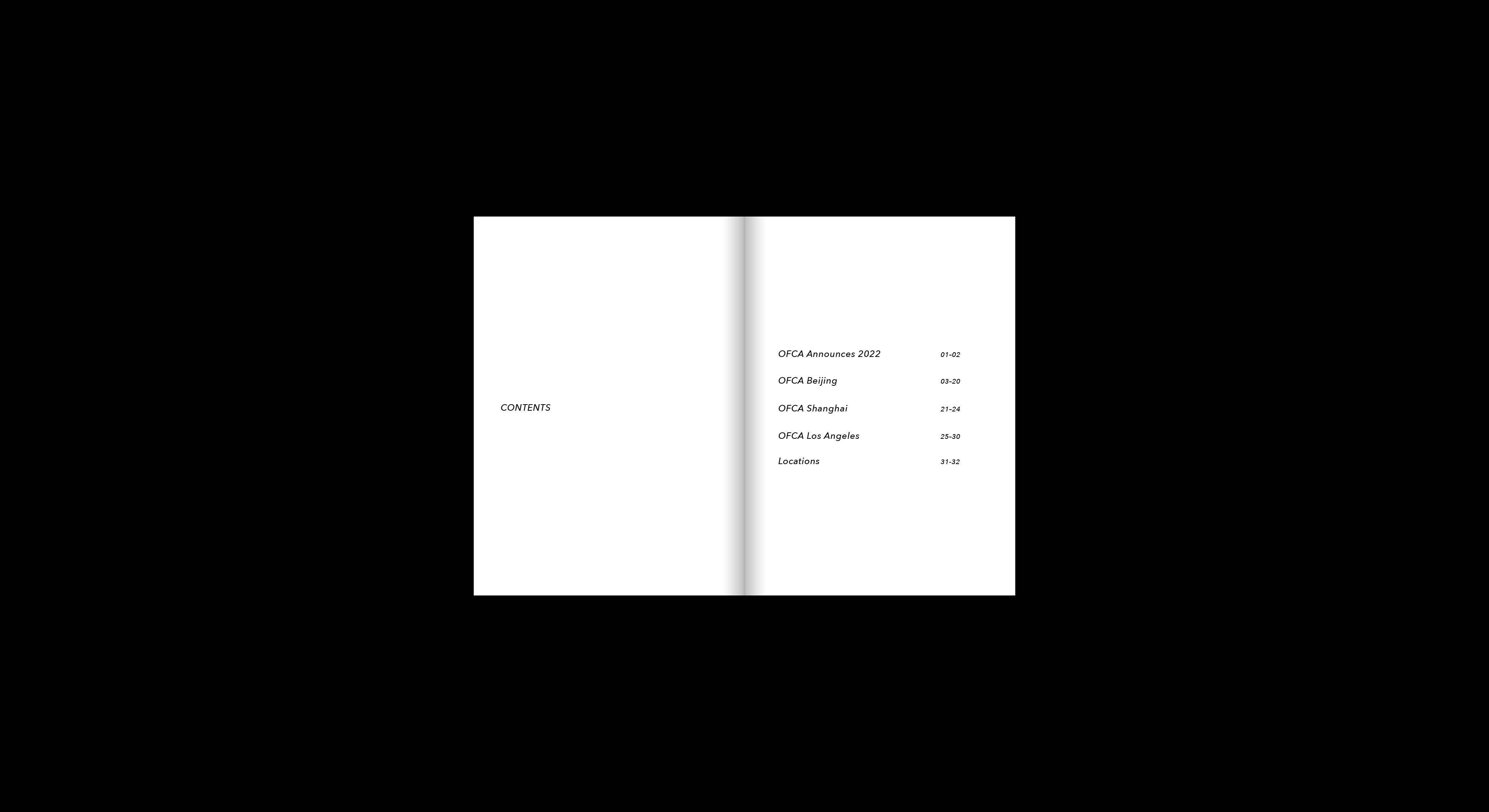
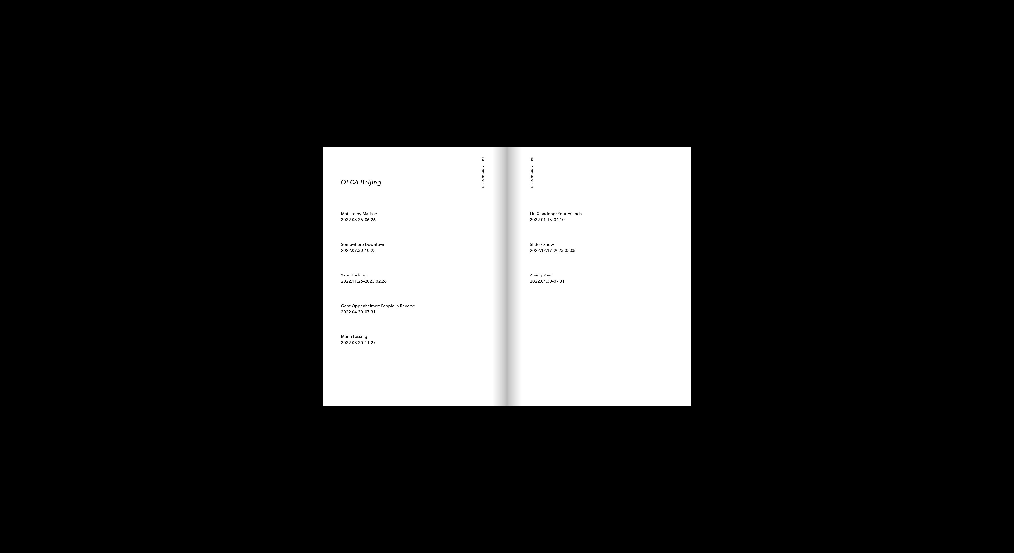
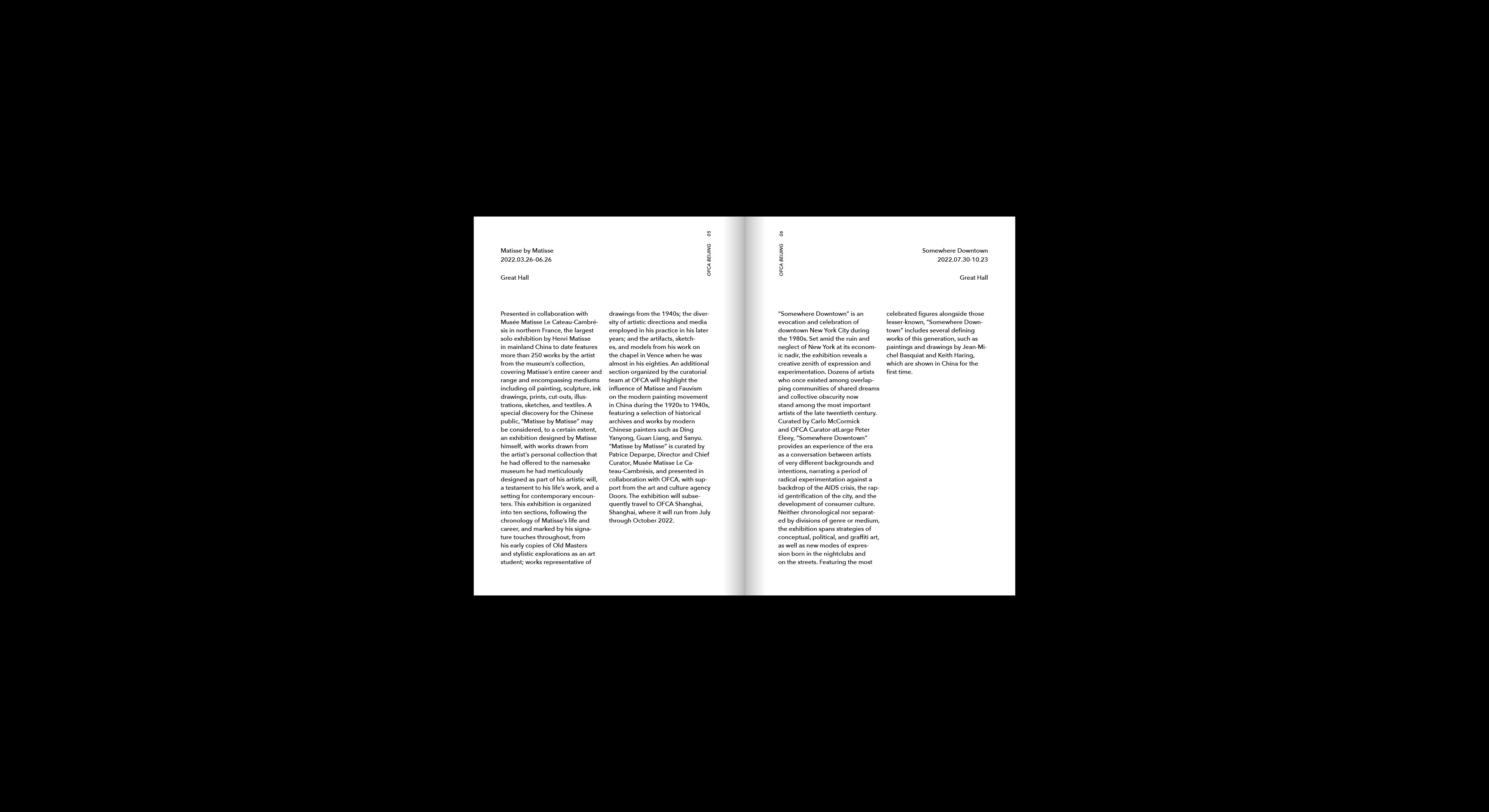
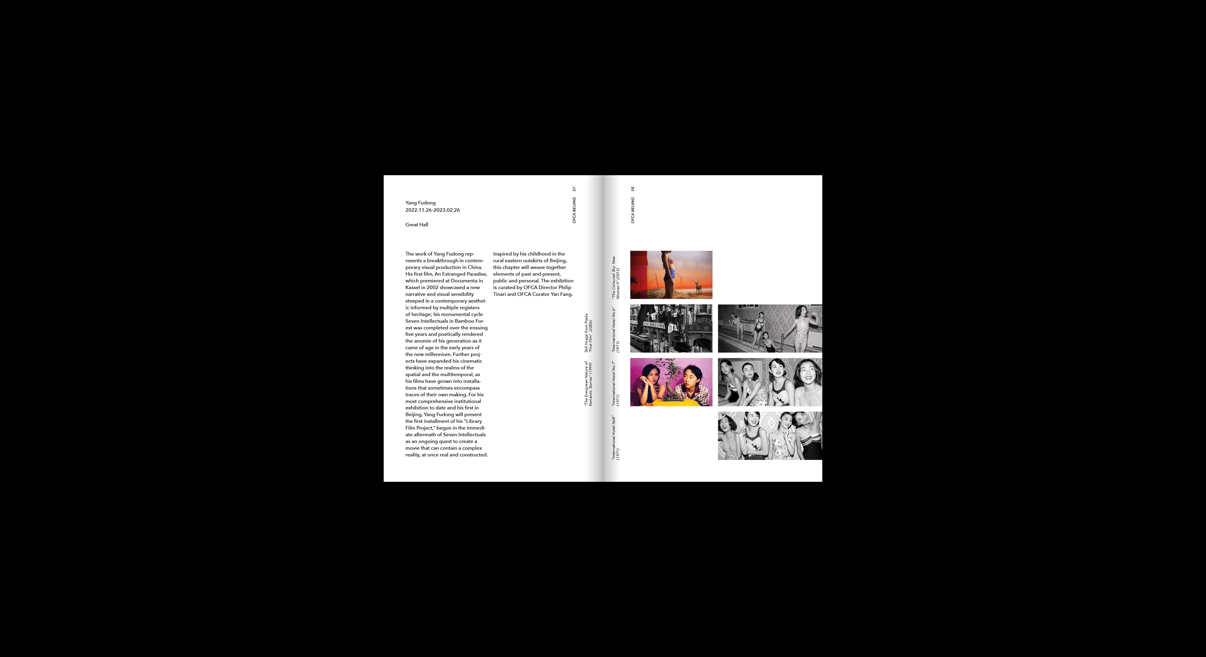
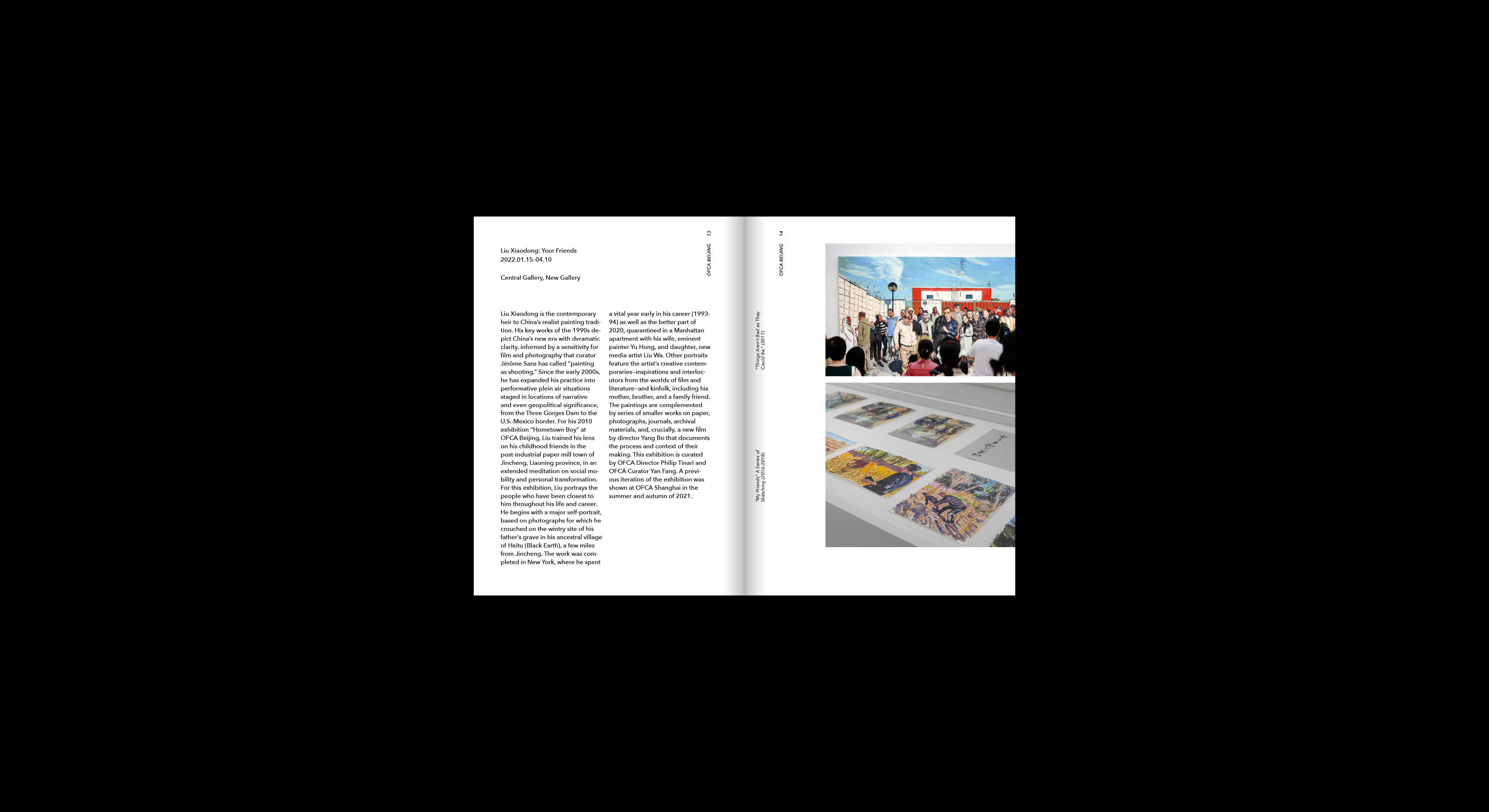
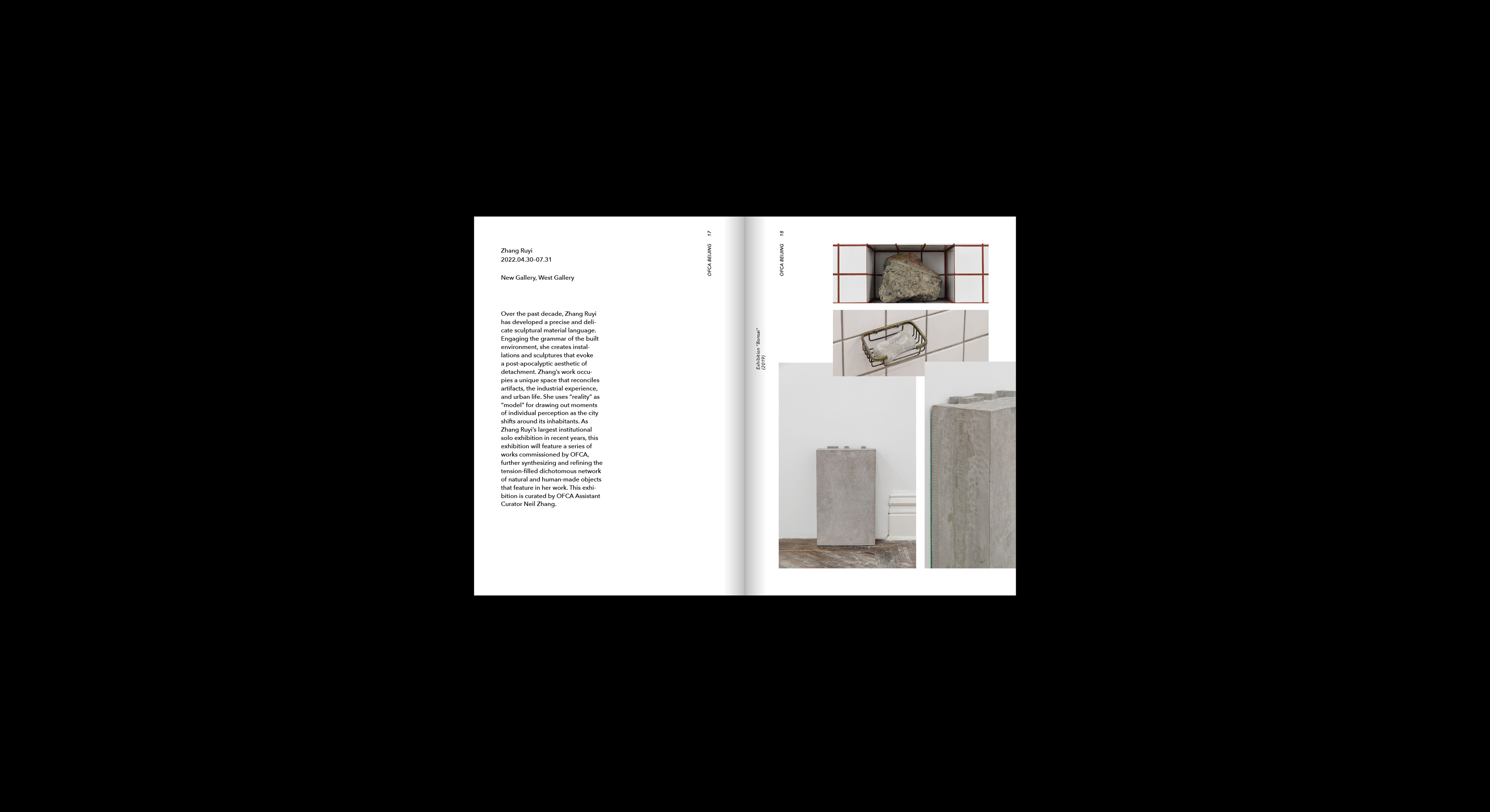
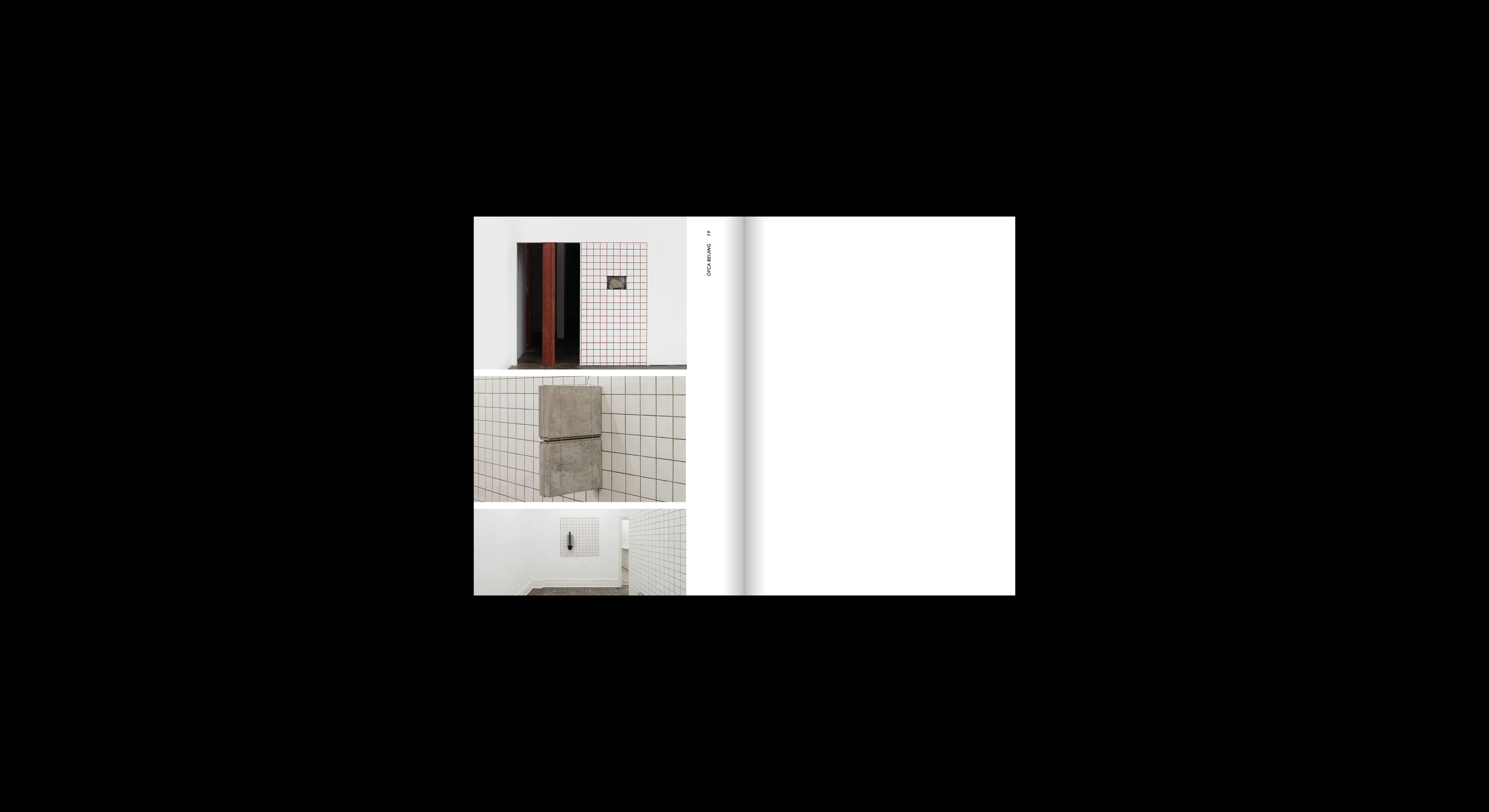
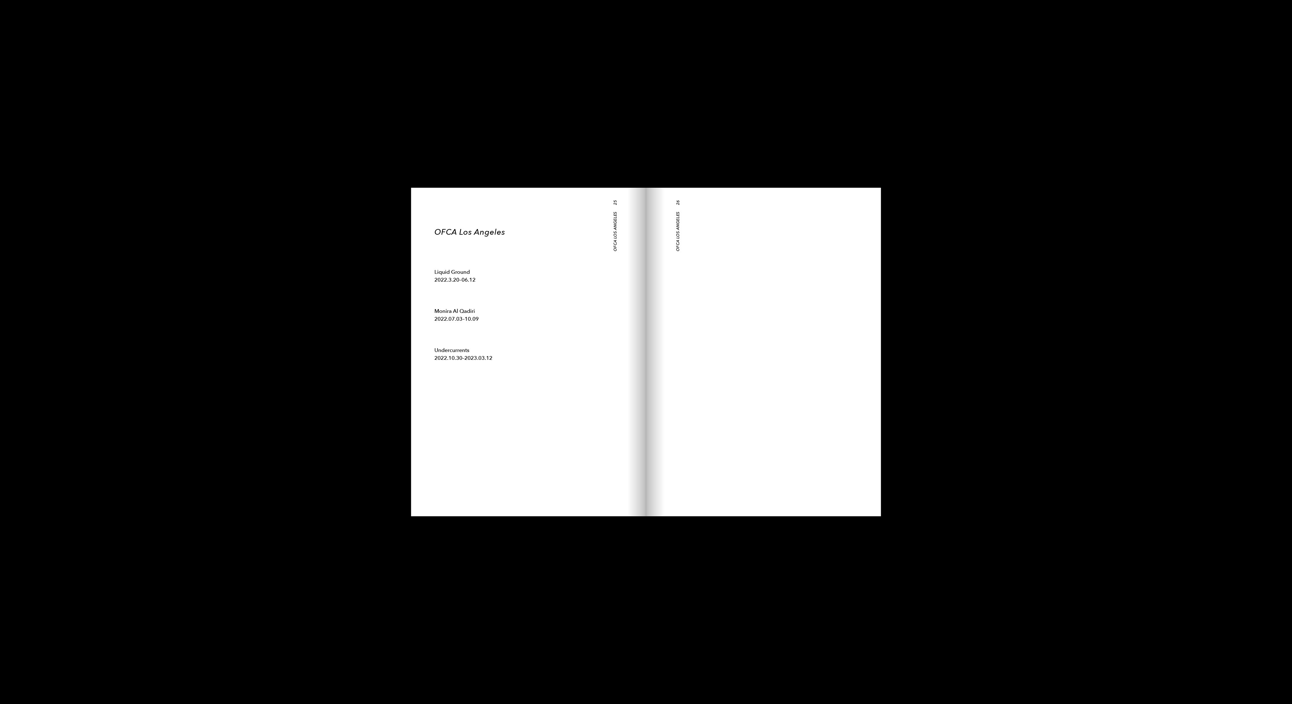
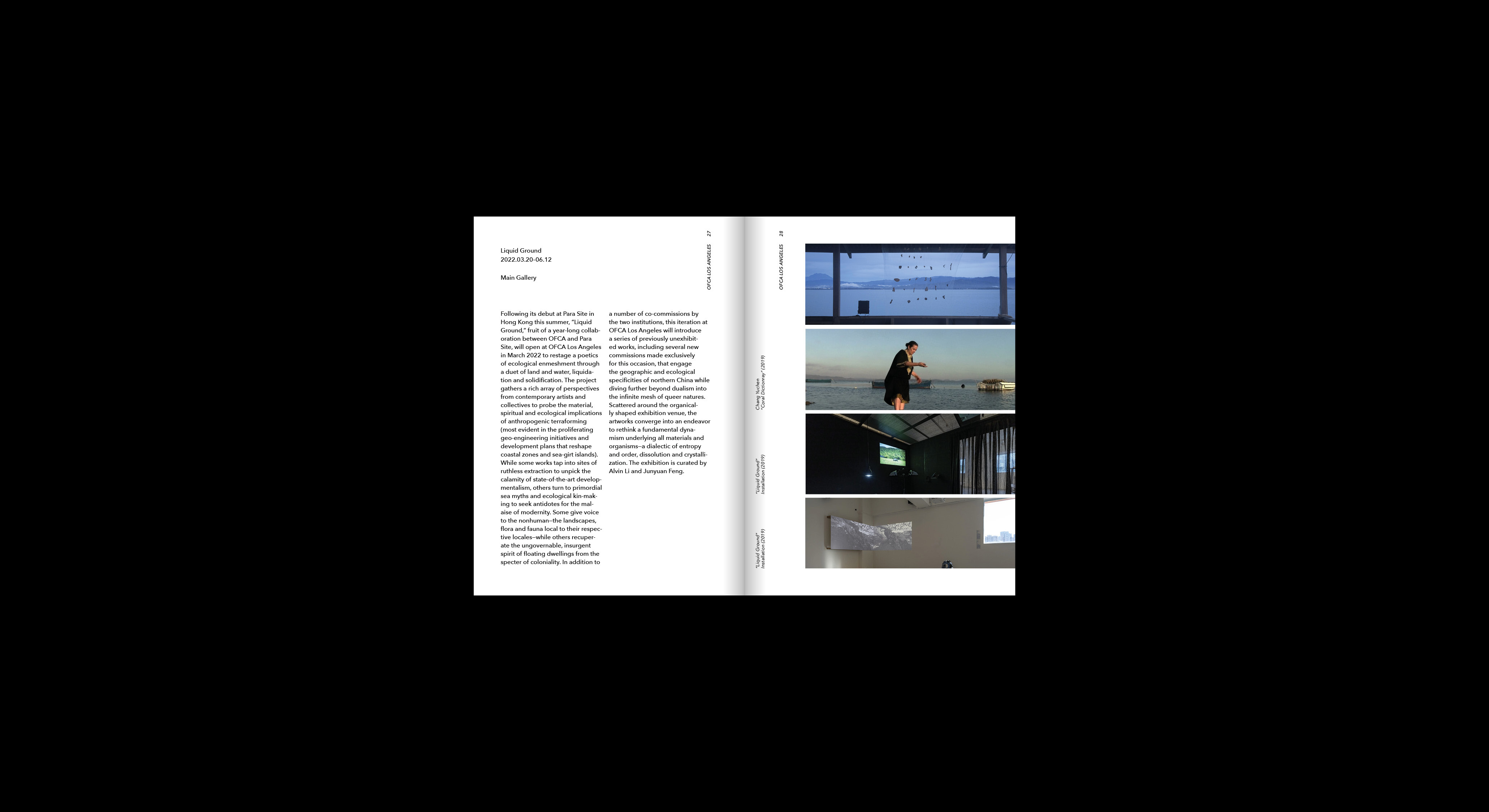
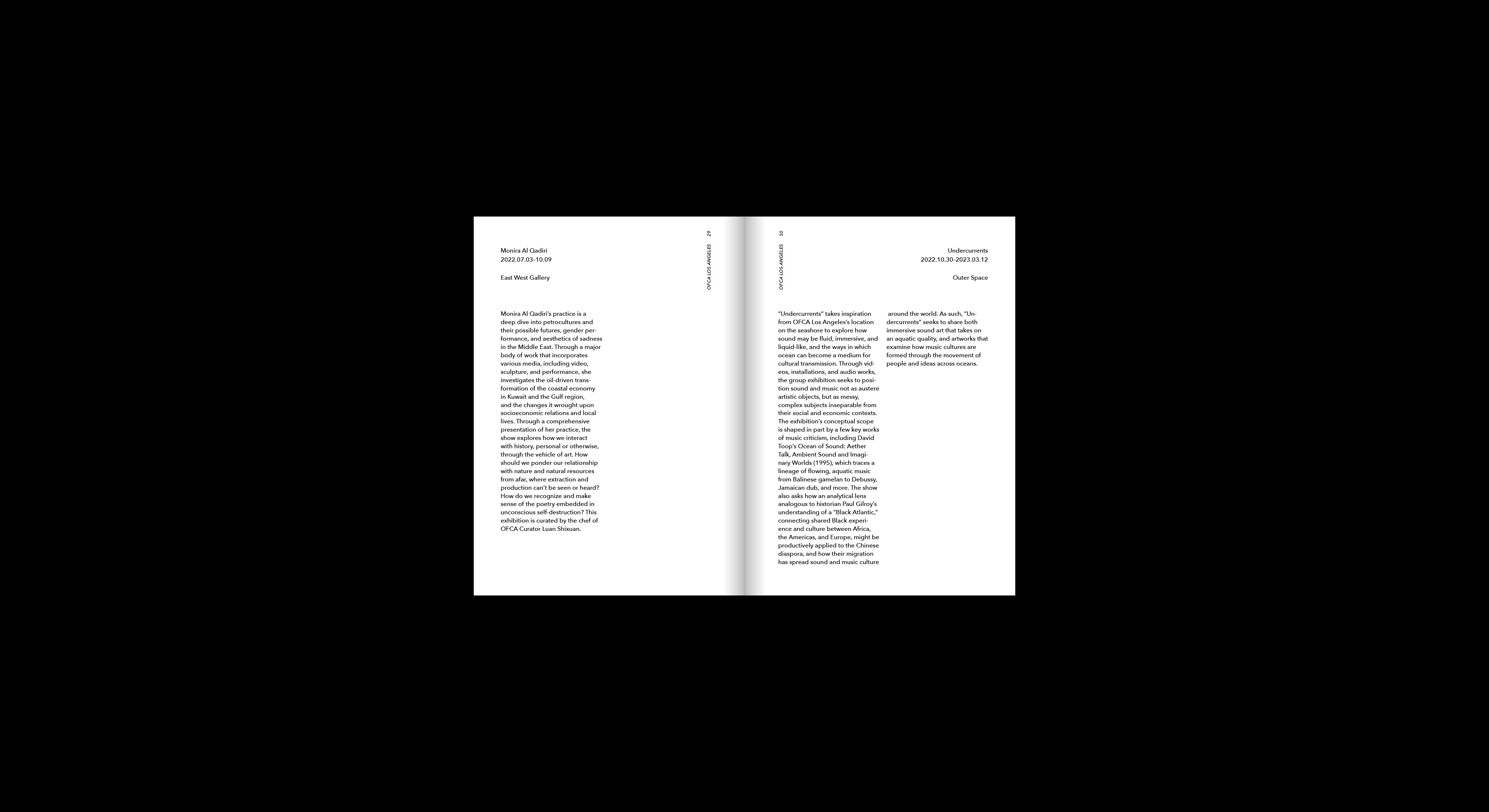
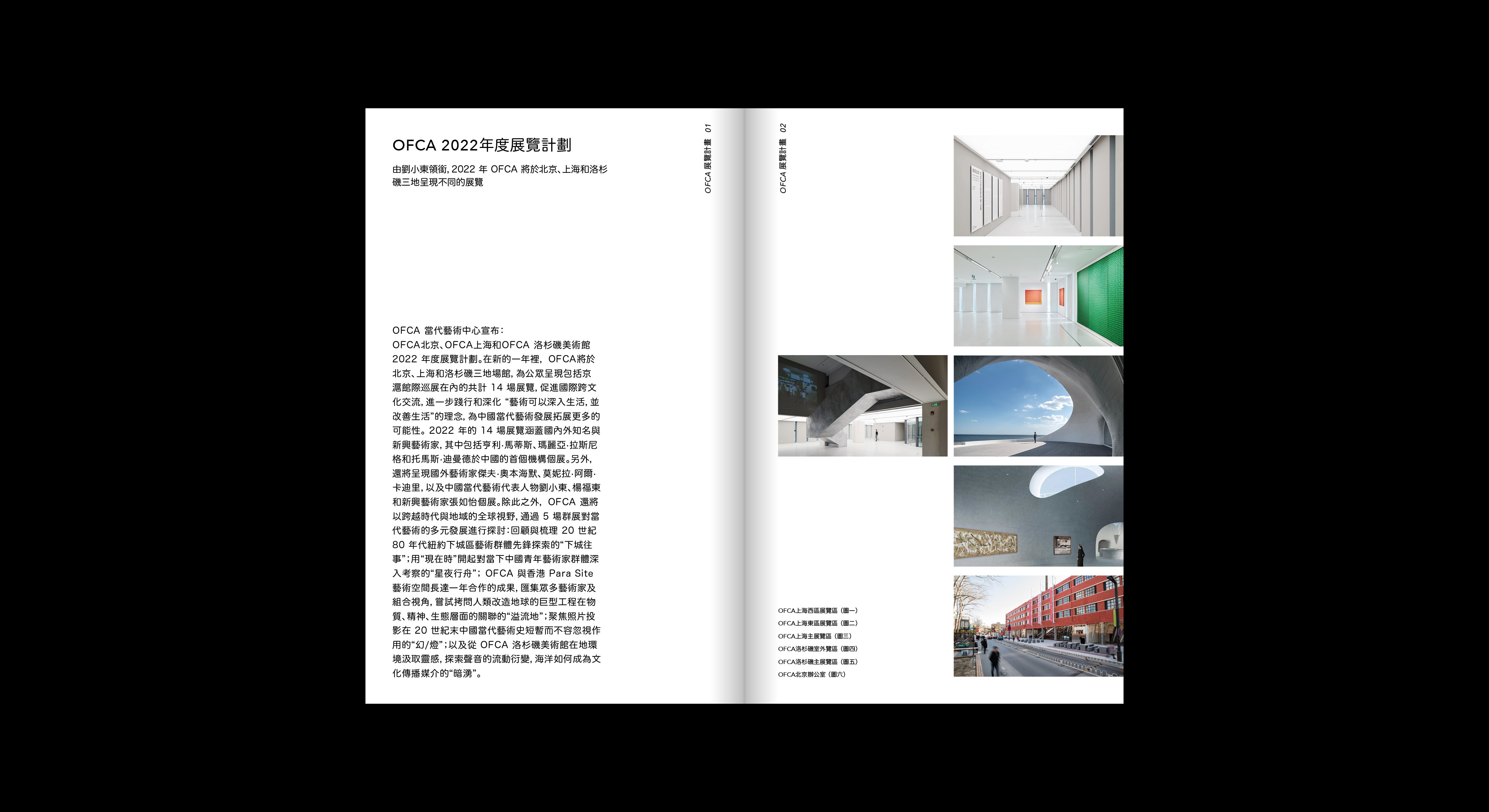
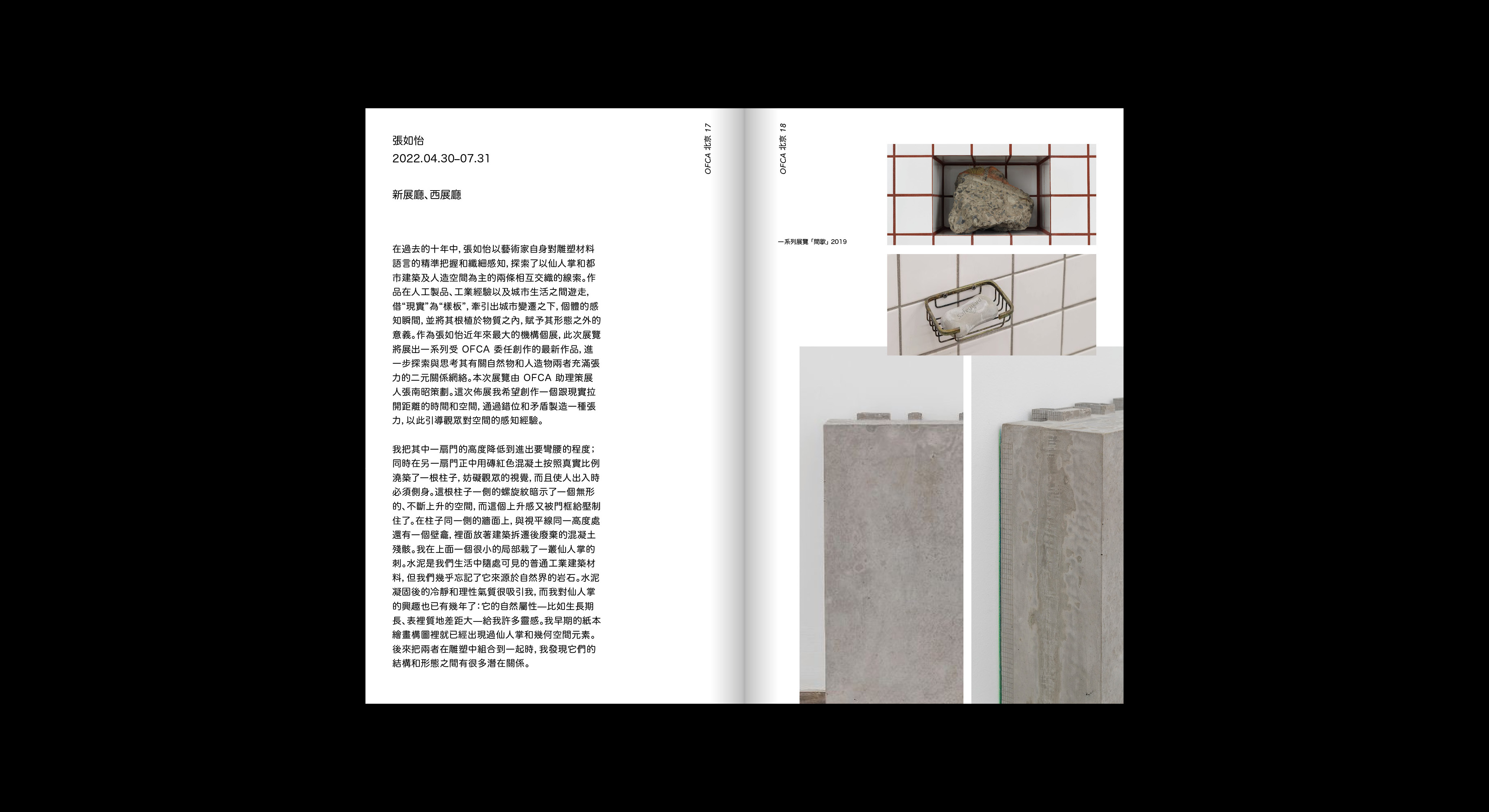
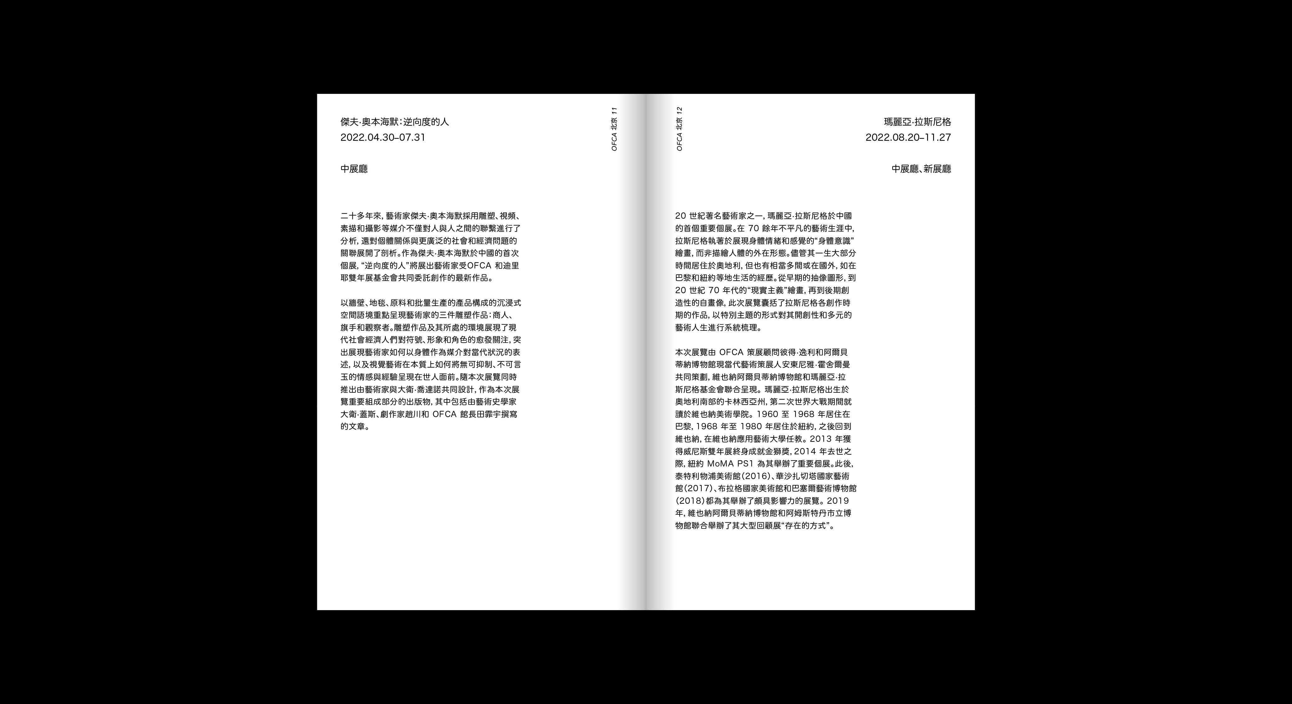
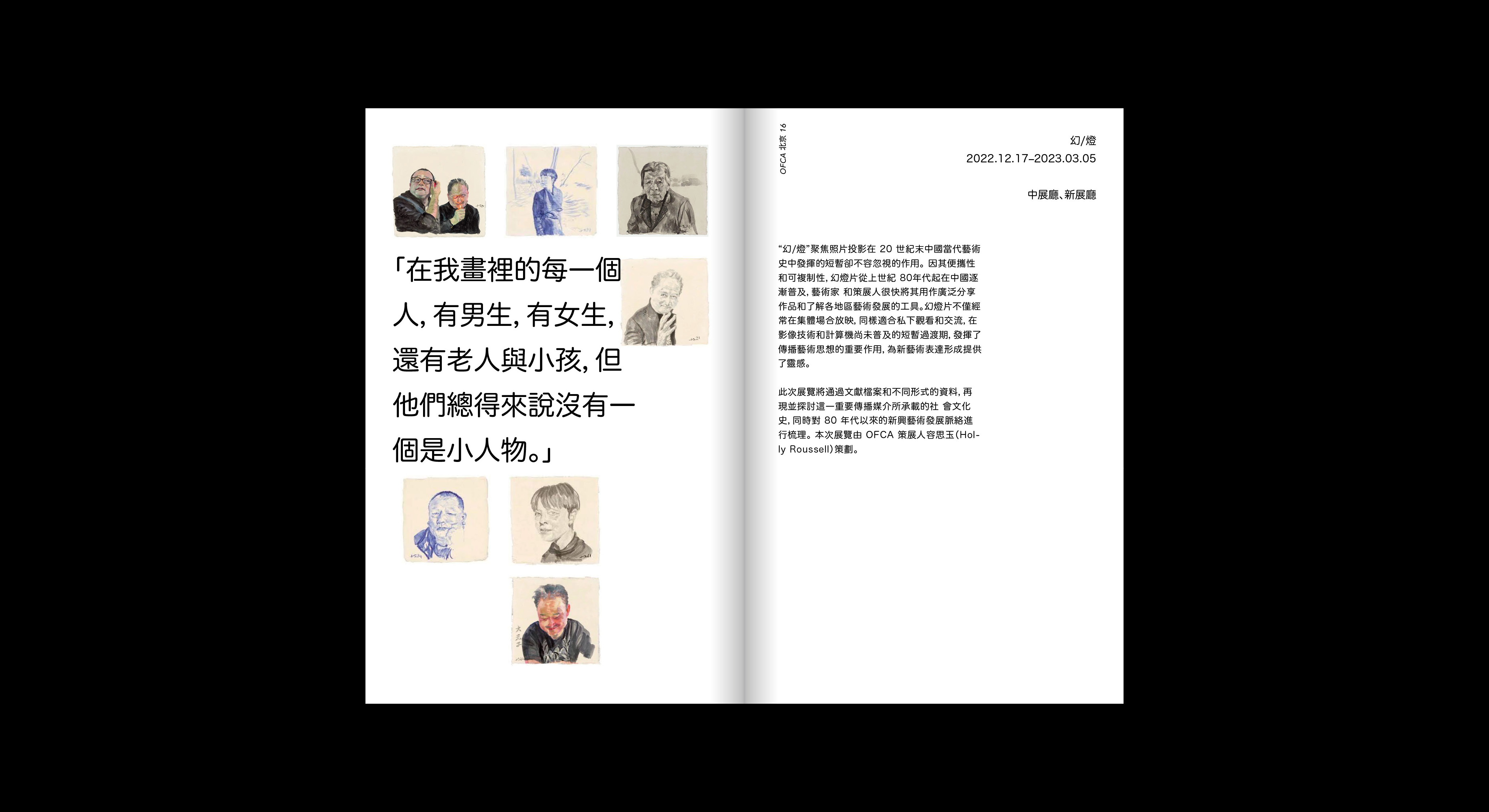
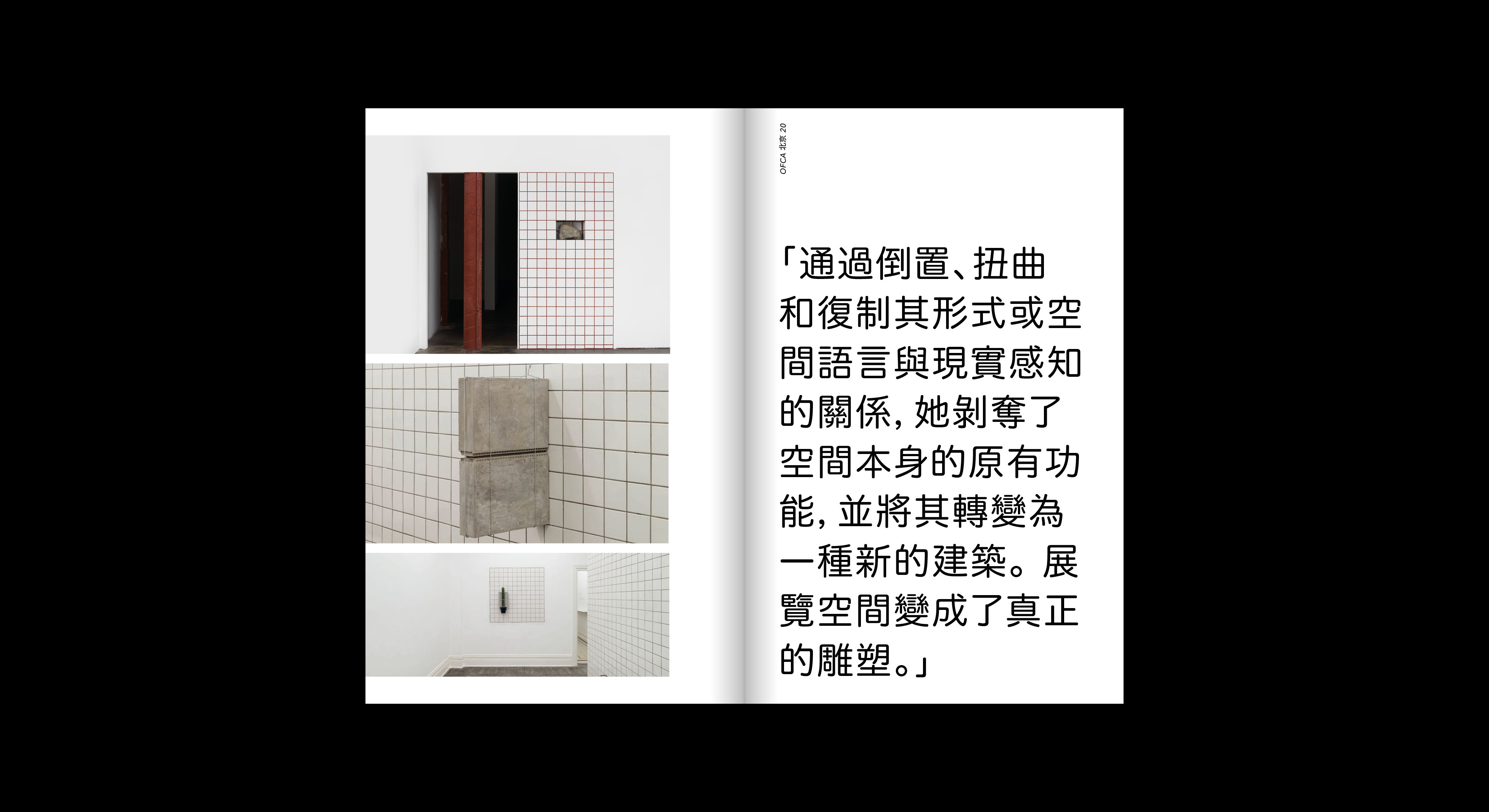
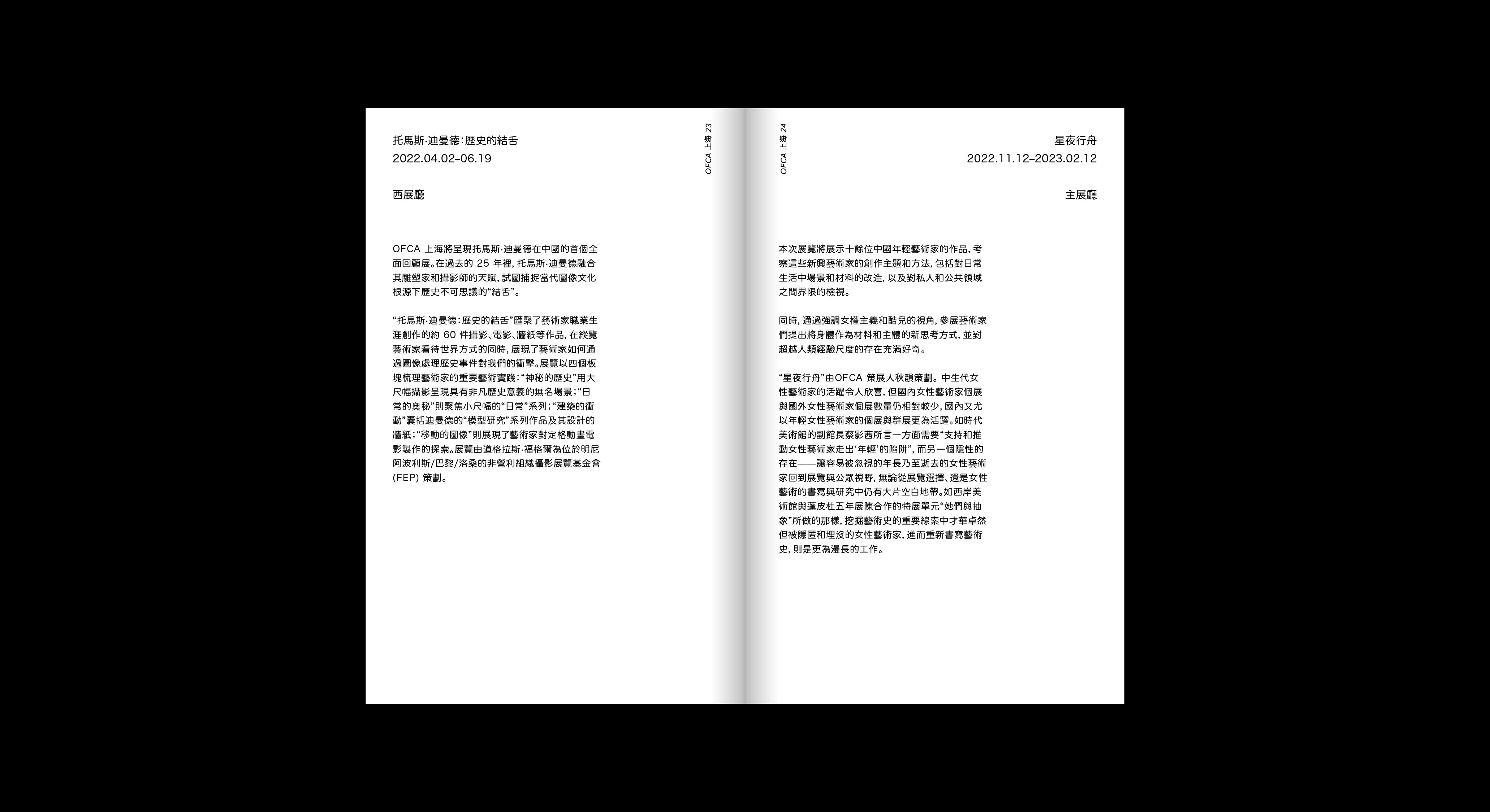
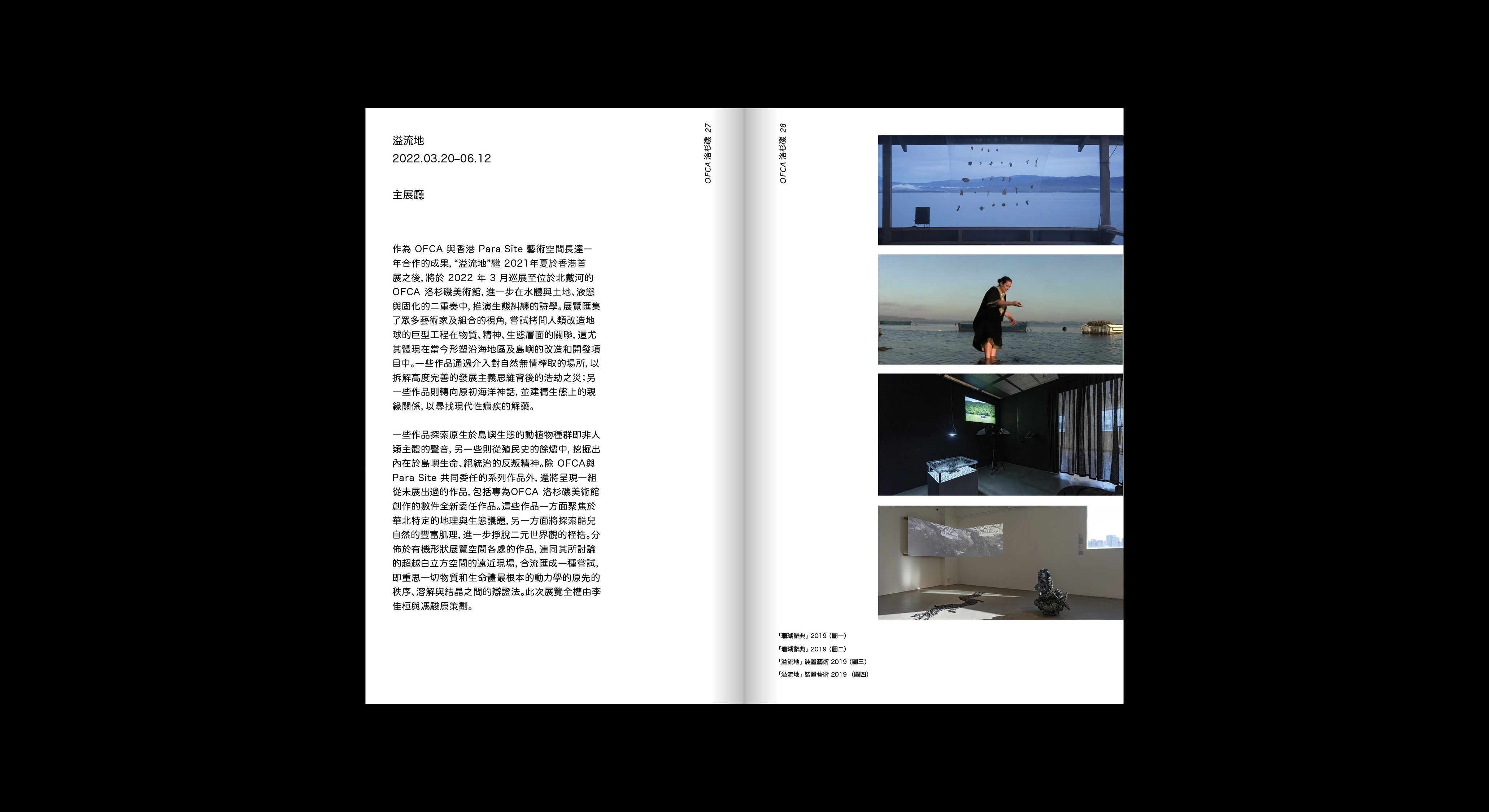
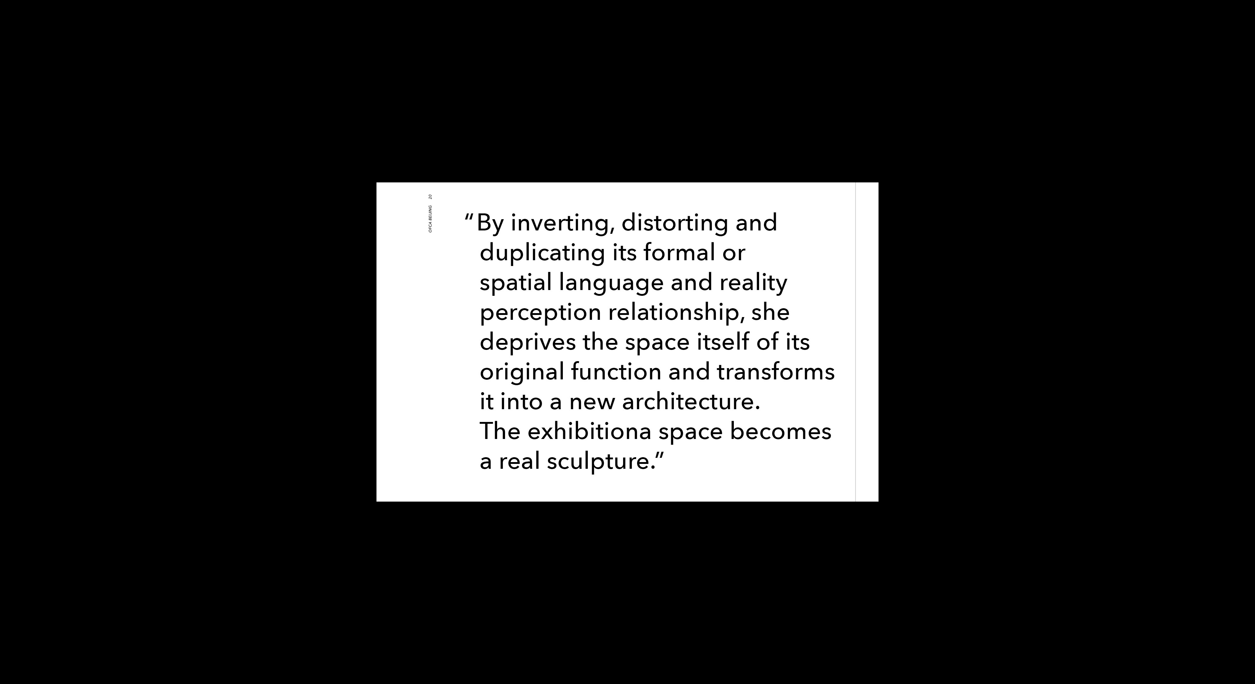
The institution published two versions of the booklet in different languages, Traditional Chinese and English, for the content of the 2022-2023 exhibition listing and programing.




(chinese version)








(english version)
